
“The first time I heard a polyphonic ringtone in a crowded bus, I honestly thought someone had brought a tiny arcade machine to life in their pocket.”
You remember that moment your phone stopped being just a boring brick and suddenly became… weird. Not powerful. Not smart. Just weird. Flip mechanisms that snapped like toy clamshells. Antennas that did nothing but make you feel like a secret agent. Keypads shaped like circles, butterflies, sometimes like something that probably should not have been a phone.
And yet, that same weirdness slowly turned into what we carry now. Your glass slab of a smartphone might feel normal today, but the DNA of those early 2000s oddballs is still in there: experiment first, refine later. Back then, manufacturers tried anything to stand out. Rotating screens. Triple hinges. Built-in gaming buttons. Cameras that swiveled like tiny periscopes. Today, it is foldables, camera bumps the size of islands, and AI filters that can rebuild your face in real time.
So when we talk about the weirdest cell phones from the early 2000s, we are not just laughing at old tech. We are looking at an era where you could actually feel the plastic, hear the hinge, and smell that fresh-electronics smell when you peeled the film off a 128 x 160 pixel display and thought, “This is the future.” Maybe it was just nostalgia talking, but those phones had character. They had weight. Literally. Some of them felt like you were carrying a small brick in your jeans.
For about five years, from around 2000 to 2005, the phone market was this wild lab. There was no guaranteed formula. No “standard smartphone” to copy. Designers were basically throwing shapes against the wall to see what would stick. Some ideas were clever and a bit ahead of their time. Some were just strange. And a few were so strange that your brain has filed them away like an old ringtone you have not heard in a decade, but would recognize instantly.
That is what this digital archive is about: pulling those forgotten experiments back into the light and asking, “What were they thinking?” and also, “What did we gain or lose when phones stopped being this odd?”
Before we jump into the five weirdest ones, keep this in mind: a lot of the comfort you feel with your current phone comes from all the weird ones that did not make it. If the early 2000s had not given us spinning keypads and banana-shaped sliders, we might not have settled on the flat rectangles we use now.
Now, let us pull these five back from the drawer.
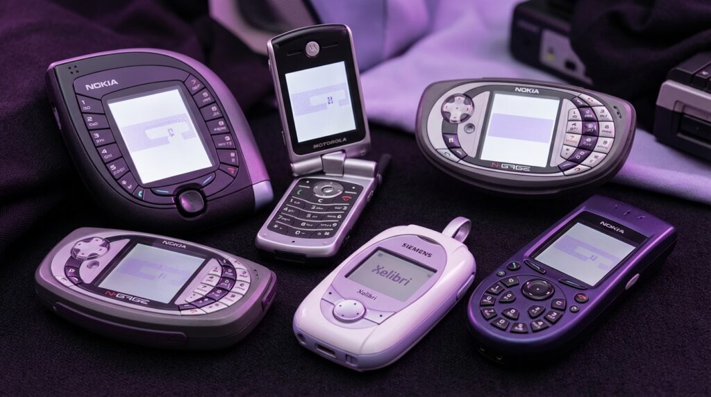
Nokia 7600: The Teardrop That Did Not Fit Your Hand
“Retro Specs: 65k color 128 x 160 screen, 2G only, VGA camera, 83 cc of pure awkward pocket geometry.”
Pick up a Nokia 7600 today and your first thought is not “phone.” It feels more like a game cartridge or some kind of futuristic pager from a low-budget sci-fi show. Released in 2003, the 7600 was Nokia trying to reinvent what a phone shape could be.
The body was this chunky teardrop, or kind of a rounded square with a point. About 87 grams, so it did not feel cheap or hollow. The plastic shell had that typical early Nokia finish: slightly textured, slightly squeaky if you pressed the battery cover too hard, but solid. You could drop it and expect the floor to take some of the damage.
The real chaos lived around the screen. Instead of a normal candybar layout, Nokia wrapped the number keys around the display. You had digits on the sides, like the phone was giving the screen a hug. It looked cool in promo shots, but using it felt like trying to type on a picture frame.
“User Review from 2005: ‘Everyone asks to see it. Then they try to text on it and hand it back like it is cursed.'”
The 128 x 160 pixel display, 65k colors, felt rich at the time. The pixels were visible if you stared closely, almost like little tiles. But at arm’s length, it gave you this nice, punchy color that made the built-in wallpapers look almost alive. Not OLED, not sharp by any modern measure, yet it had a certain charm. Backlight slightly bluish, text a bit blocky, menus with that unmistakable Nokia UI sound.
Typing, though, was the tax you paid for that shape. Traditional T9 muscle memory went out the window. The buttons did not run in rows; they were arched around. Your thumbs had to relearn where 1, 2, and 3 even lived. You might remember staring down, pausing before every text just to make sure you were not pressing 8 when you wanted 5.
From a tech angle, the Nokia 7600 was actually not bad. 2G, VGA camera, some basic multimedia stuff. But in practice, it was one of those phones you bought to show people, not to use for three years.
Then vs Now: Teardrop vs Slab
| Feature | Nokia 7600 (2003) | iPhone 17 (Modern Flagship) |
|---|---|---|
| Shape | Teardrop / rounded square, keys around the screen | Flat rectangular slab, near bezel-less front |
| Display | 128 x 160, 65k colors, ~2 inch | ~6.3 inch OLED, ~2796 x 1290 or higher |
| Typing | Physical T9, radial layout | Full-screen capacitive keyboard, haptics |
| Camera | VGA (0.3 MP) | Triple or quad camera, 48 MP+ with computational photography |
| Network | 2G (GSM) | 5G / 5G Advanced |
| Main Flex | “Look how strange my phone is” | “Look what my phone can shoot and process instantly” |
Nokia was chasing the “fashion phone” idea hard. Swap covers, weird shapes, devices more like accessories than tools. If you walked into a club with a 7600, people noticed. Try that with a modern phone, and from a distance they all look almost the same.
Maybe it was just nostalgia talking, but there was something honest about a phone that said, “I am impractical, but at least I do not look like everyone else.”
Siemens Xelibri 6 (X6): The Compact from a Sci-Fi Purse
“Retro Specs: 101 x 42 x 18 mm, CSTN display, dual-band GSM, designed more like jewelry than a handset.”
The Siemens Xelibri line might be one of the strangest side quests any major brand took in that decade. Instead of making better phones, they tried to make phones that looked like fashion accessories. The Xelibri 6, released around 2003, looked like something you would find in a futuristic dressing table, not in a phone shop.
Imagine a metallic compact mirror that got confused halfway through manufacturing and decided to be a phone. That was the X6. Smooth, shiny surfaces. A shape that fit better in a handbag than in jeans. The screen was tiny and square, with a CSTN panel that gave you muted colors, slightly slow response times, and that faint ghosting when you scrolled through the menu too fast.
The keypad was the real show. Instead of straight rows, the keys were often arranged in unusual patterns. Small, round, and not exactly friendly if you had big thumbs. Pressing them felt almost like clicking on costume jewelry: shallow travel, soft feedback, not really built for 200 texts a day.
“User Review from 2005: ‘My phone matches my lipstick case. I love it. I hate writing messages on it. But I still love it.'”
From a spec sheet point of view, the Xelibri 6 was nothing special. Dual-band GSM, basic SMS, maybe some basic games. No camera on some units. No music player worth bragging about. It was not meant to compete with the heavy hitters. It was more like a fashion statement that happened to make calls.
What made it weird was the design-first approach. The tech was an afterthought. Imagine doing that now with a flagship: “Forget cameras and chips, does it match your shoes?” Back then, Siemens tried to see if people would buy a phone because it looked like part of their outfit.
The funny thing is, you can see hints of that logic in modern tech. Colored phone cases, foldable phones in pastel shades, watch bands that match sneakers. The difference now is that the core device is strong first, fashion second. With Xelibri, it was flipped.
Then vs Now: Fashion First vs Tech First
| Feature | Siemens Xelibri 6 (2003) | Modern Style-Driven Phone |
|---|---|---|
| Design Priority | Looks as fashion object, tech secondary | Strong specs first, then color/material options |
| Build | Glossy plastic, compact-like shape | Glass, aluminum or steel, flat or foldable form |
| Display | Small CSTN, low resolution | Large high-res OLED with high refresh rate |
| Target User | Fashion-focused buyer, low usage expectations | Style-aware user, still needs strong camera and performance |
| Durability | Physical scuffs but survived drops | Tempered glass, prone to cracks without case |
Phones like the Xelibri 6 feel strange now, but they were early experiments in the idea that tech could be wearable, could be an accessory. That thread runs straight into smartwatches, smart rings, and earbuds that come in six colors.
Maybe the Xelibri line was just too early, with hardware that did not match the ambition.
Motorola V70: The Swivel That Thought It Was a Spy Gadget
“Retro Specs: 96 x 64 pixel monochrome display, GPRS, 360-degree rotating cover, 83 grams of spy-movie energy.”
If you ever held a Motorola V70, you remember that swivel. The front of the phone did not just flip; it rotated in a perfect arc. Picture a circular window that swings open to reveal a keypad. It felt less like answering a call and more like opening a secret compartment.
Closed, the V70 was almost a fashion piece. A slim, curvy bar with a circular cut-out that showed a round monochrome display. The display itself was small and low-res, but behind that circular window it looked deliberate, like a watch face. When someone called, the tiny backlit screen glowed with that pale gray-green tone, text pixelated but sharp enough to read.
To answer, you pushed gently on the front and the cover rotated sideways. There was a faint click as the internal mechanism hit its stops. The motion felt smooth, almost luxurious compared to some of the rattlier flip phones of the era. You could not resist doing it over and over, like flicking a lighter open.
“User Review from 2005: ‘Every time I open it I feel like I am about to call in an airstrike. Unfortunately, I am just ordering pizza.'”
The keypad underneath was compact, with small, oval keys. Backlighting was usually blue, casting this cool glow that made night-time texting possible but not exactly easy. The phone was more about style than typing comfort, but voice calls were fine. Reception was decent, the earpiece clear enough, and the mic good for that era.
Strictly speaking, the V70 was not packed with features. It had GPRS, WAP browsing that felt more like punishment than a feature, basic ringtones, and phonebook storage that seems laughable now. Yet it stood out because of that one motion: swivel to answer, swivel to end.
Sound familiar? Modern foldables and swing-out camera arrays carry the same basic thrill: a moving part that turns a static slab into something interactive.
Then vs Now: Swivel vs Fold
| Feature | Motorola V70 (2002) | Modern Foldable Phone |
|---|---|---|
| Main Gimmick | Rotating front cover to reveal keypad | Hinged flexible display that folds in half |
| Display Type | Small monochrome, circular window | Large OLED, foldable, high refresh |
| Durability Concern | Wear on the swivel mechanism | Crease and hinge fatigue |
| Use Case | Phone calls, SMS, status symbol | Full smartphone use, multitasking, media |
| Tactile Factor | Strong: physical rotation every time you use it | Strong: open and close like a book or compact |
The interesting part is that the V70 proved something: people like phones that move. There is a physical satisfaction in a hinge that slides or turns. Today, when someone folds their phone shut with a soft snap, it taps the same part of the brain that loved spinning the V70 cover open just to check the time.
Maybe it was inconvenient. Maybe it was fragile. But it felt fun.
Nokia 3650: The Circular Keypad That Broke Your Brain
“Retro Specs: Symbian OS, 176 x 208 color display, VGA camera, circular keypad designed like a rotary phone gone digital.”
If there was one early 2000s phone that looked normal from the top half and completely unhinged from the bottom, it was the Nokia 3650. At first glance: candybar shape, color screen, little camera on the back. Flip it around or look down the front, though, and you got that circular keypad.
Instead of three columns of keys, Nokia dropped them into a circle. 1 at the top, then continuing around like the numbers on a rotary dial. It was a bold move for a world that had just gotten comfortable with T9.
The phone itself had a bit of heft, somewhere around 130 grams. Not overweight, but you could feel it in your pocket. The plastic felt dense, the back cover slightly textured. The screen, 176 x 208 pixels, was bright for its time. Icons were small but colorful, and you could see the slight grain of the pixels, especially on images from the built-in VGA camera.
Booting it up gave you that familiar Nokia chime, then the Symbian interface loaded. Small status icons, a basic grid menu, and more features than most non-nerds expected in a phone at that time. This was not just for calls. You could install apps, play more complex games, and manage files, all on a device that looked like a spaceship remote.
And then there was texting.
“User Review from 2005: ‘The OS is smart. My thumbs are not. This keypad makes me type like I am learning to walk again.'”
The logic behind the circular keypad was partly aesthetics, partly a nod to old rotary phones. But your muscles did not care about that heritage. Years of “2 is left, 3 is right” vanished. You had to look down constantly, especially in the first weeks. Key travel was solid, the click satisfying, but your speed took a huge hit.
From a tech standpoint, the 3650 was forward-looking: Symbian smart features, a camera, expandable memory. From a user-experience standpoint, the keypad held it back for normal people. You can almost picture the meeting: “What if we make a smart phone that looks unique on the shelf?” They nailed that part. Everyone remembered the circle. Fewer remembered wanting to keep using it.
Then vs Now: Hardware Weirdness vs Software Weirdness
| Feature | Nokia 3650 (2003) | Modern Smartphone |
|---|---|---|
| OS | Symbian Series 60 | iOS / Android |
| Main Quirk | Circular hardware keypad | Software UI changes, gestures, virtual keyboards |
| Learning Curve | Mostly physical: thumb position, key layout | Mostly gesture-based: swipes, long-press, multitouch |
| Camera | VGA, basic stills | Multi-lens, video, AI processing |
| Expansion | Memory cards, installable apps from basic stores | App stores with millions of apps |
In a way, the 3650 shows a pivot point. Hardware experiments were starting to hit the wall for usability. At the same time, software was getting more complex. Today, you still get weirdness, but it hides more in the interface than in the shape of the device.
Maybe it was just nostalgia talking, but there is something charming about a phone that wore its weirdness on the outside, not as some hidden menu setting.
Samsung N-Gage: The Taco You Talked Into
“Retro Specs: Symbian-based, 176 x 208 display, gamepad-style layout, side-talking earpiece that made it look like you were talking to a taco.”
You cannot talk about weird early 2000s phones without mentioning the N-Gage. Technically it was a Nokia, not Samsung, but in some places the name got mixed when people traded hand-me-down stories. Either way, the concept was simple: mash a Game Boy Advance and a phone into one device and ship it.
Held horizontally, the N-Gage felt like a game console. Directional pad on one side, number keys that double as game buttons on the other, screen in the center. The plastic shell had a grippy texture, with vent-like lines that made it look a bit like a mini stereo system. When you held it, your fingers naturally curled around the sides, like a controller. Comfortable for gaming, slightly strange for texting.
The screen, again 176 x 208 pixels, was bright enough to show early 3D-ish games. You could play titles like Tony Hawk and Pathway to Glory, which looked decent on that tiny panel. Colors were slightly washed compared to modern screens, but in a dark room it did the job. You could see the pixel structure, sure, but it added that old-school gaming feel.
The weirdest part was not the shape though. It was the way you made calls.
To use the earpiece, you had to hold the side of the N-Gage against your head. Not the front. The narrow edge. From a distance, you looked like you were talking into a thick, gray taco.
“User Review from 2005: ‘Great for games, embarrassing for calls. My friends called it “The Side Talker.”‘”
Swapping game cartridges was another headache. You had to open the back, take the battery out, then change the card. That meant power off, power on, repeat. The hardware design served the “look like a console” goal more than the “function like a phone” goal.
Still, it foreshadowed something big: phones as gaming platforms. N-Gage tried too early with clunky hardware, but the idea that your pocket device could be a serious gaming machine? That is normal now. Look at mobile-only esports, controller attachments, and high-refresh screens that exist just so games feel smoother.
Then vs Now: Dedicated Game Phone vs Game-Ready Phone
| Feature | Nokia N-Gage (2003) | Modern Gaming Phone |
|---|---|---|
| Primary Identity | Game console that can make calls | Phone that can run console-level games |
| Controls | Physical D-pad, mapped number keys | Touchscreen, optional clip-on controllers, haptics |
| Game Distribution | Physical cartridges / MMC cards | Digital downloads from app stores and game services |
| Cooling | Passive, plastic shell | Vapor chambers, fans in some models |
| Call Experience | Side-talking, awkward grip | Normal front-facing speaker or earbuds |
The N-Gage became a bit of a joke at the time, mostly for that side-talking design. But it also hinted at a future where your phone was no longer just a communication device. It was a portable console.
If you fire up a high-end mobile game today with full 3D graphics and online multiplayer on a modern flagship, a small part of that experience traces back to this strange gray taco that made people stare at you on the bus.
Kyocera VP-210 / Early Camera Phone Oddities: The Selfie Before Selfies
“Retro Specs: CIF camera, tiny color display, could transmit still images over cellular at a time when most people used dial-up at home.”
Before camera phones became normal, they were weird. Cameras were bolted on like afterthoughts: bumps, swivels, or modules that snapped into connectors. The Kyocera VP-210 from around 1999 is slightly earlier than the core early 2000s range, but its influence lingered into that era of experiments.
The VP-210 had a front-facing camera when nobody even had a name for “selfie” yet. The body felt like a stretched-out pager with a lens. The plastic shell was light, almost toy-like, with a prominent circular camera on the front. The display was tiny and color, but not sharp. You could just about make out your own face if you squinted and accepted that you were basically made of Lego blocks.
It could capture, store, and send still images over networks that were slower than what your fridge probably runs today. But the idea was huge: send your face, not just your voice or text.
“User Review from 2005: ‘I can send my picture. It looks like it was taken through a potato, but it works.'”
From there, early 2000s phones ran wild with camera placement. Some had rotating camera modules mounted on the top so you could flip between front and rear with a single twist. Others had sliders that exposed the camera only when you needed it. Picture a chunky bar phone where the top half spun around on a little axis. You heard a slight mechanical grind as it rotated, not exactly smooth by modern standards, but satisfying.
Resolution was low: CIF, VGA, maybe 1 megapixel if you were lucky and paid more. Photos had blown-out highlights, strange color balance, and digital noise everywhere in low light. Yet the idea of capturing a moment from your pocket without film felt powerful, even if the result looked worse than a modern smartwatch snap.
Then vs Now: Camera Experiment vs Camera Dominance
| Feature | Early Camera Phones (2000-2003) | Modern Camera-Centric Phones |
|---|---|---|
| Camera Placement | Front-only, rotating modules, sliders | Multi-lens rear, punch-hole or under-display selfie |
| Resolution | CIF to 1 MP | 12 MP to 200 MP with pixel binning |
| Use Case | Novelty, small MMS or email images | Photography, video, content creation, social media |
| Image Quality | Low detail, heavy noise, slow shutter | High dynamic range, night mode, stabilization |
| Physical Design | Weird bumps, swivels, rotating heads | Camera islands, bumps, sometimes periscope modules |
The strange camera-phone prototypes of the early 2000s were clumsy, but they kicked off the idea that the camera is not a side feature. It is one of the main reasons people upgrade. That idea has only grown. Today, when you look at phone keynotes, the camera segment often takes the longest.
Back then, just sending someone a grainy picture of your lunch felt like magic, even if nobody had invented the phrase “food pic” yet.
Why These Weird Phones Still Matter
If you hold one of these early 2000s oddities in one hand and a modern smartphone in the other, the differences feel huge. Smooth glass vs cheap-feeling plastic. Seamless touch vs clacky keys. Multi-lens cameras vs a lonely, tiny sensor. Yet under all that progress, you can still trace direct lines.
Those old design teams asked the questions that shaped what we expect now:
– Could a phone be fashion, not just function?
– Could it be a game console?
– Could it be a camera?
– Could the shape itself make people want it?
They answered with teardrops, compacts, swivels, circles, and tacos. Most of those answers did not survive. The market sanded off the weird bits until we landed on the safe rectangle you probably have near you right now.
But every time a modern company experiments with a foldable screen, a pop-up camera, a transparent back, or a wild color finish, they are poking at the same problem those early 2000s designers wrestled with: how do you make a piece of everyday tech feel special without making it impossible to use?
“Retro Specs: Plastic shells under 200 grams, sub-200 ppi screens, T9 keypads, and more character in a hinge click than some modern phones have in their entire UX.”
The early 2000s weird phones remind us that the path to your current device was not clean or linear. It was full of false starts and side quests. Some of those side quests were ridiculous. Some were brilliant but mis-timed.
And somewhere between a circular keypad and a swiveling front cover, the modern smartphone started to take shape.
