
“The soft thud of a plastic home button, the tiny click as you rearranged wobbly icons on iOS 6, that glossy skeuomorphic Notes app that tried so hard to look like a legal pad.”
You remember that feeling, right? Staring at your iPhone’s grid of icons, long pressing one until it shook like it was nervous and waiting for you to decide its fate. Back then, customizing your iPhone meant changing a wallpaper, maybe moving Safari to the bottom right because you were a rebel. Now you are staring at iOS 18, where widgets breathe, icons shift between Light and Dark Mode, and Shortcuts glue all the weird parts of your digital life together.
The funny part is, that same urge is still there. The urge to make your phone feel like *your* phone. The difference is that where we once forced ringtones through iTunes and weird MP3 hacks, now we are wiring widgets, custom icon packs, and Shortcuts automations that can run half your day while you are just scrolling through your lock screen. Maybe it is just nostalgia talking, but the gap between a Nokia 3310 and an iPhone running iOS 18 feels bigger than the gap between a cassette player and Spotify.
Back in the early smartphone years, Apple treated the home screen like a museum. Beautiful, controlled, not to be touched too much. You got a grid, you got some folders, you got a wallpaper, and that was it. No extra widget pages. No lock screen complications. No Focus modes with different layouts. The idea was “we know what is clean, just trust us.”
Then Android users started flexing: weather widgets, minimal icon packs, launchers that looked like sci-fi HUDs. iPhone owners secretly wanted that control, even if they told their friends they liked things “simple.” Underneath, there was this tension: the hardware was premium, the software was polished, but personalization felt stuck in 2009.
The shift started slow. Widgets in Today View. Then widgets on the home screen in iOS 14. Lock screen customization. Focus profiles. And now, iOS 18 has reached the point where your iPhone feels less like a static tool and more like a modular control panel. Not as wild as some Android setups, but way more expressive than the early grid days.
You are no longer just dropping icons next to each other. You are deciding what data should be visible without opening an app, which actions deserve a one-tap Shortcut tile, how your home screen should change when you start work, drive, or wind down at night. Your device moves from “app launcher” to “dashboard.” And if you remember the old days of T9 and polyphonic ringtones, the evolution feels huge.
Retro Specs: User setup, 2007
Home screen: fixed grid, no folders.
Customization: wallpaper, ringtones, rearrange icons.
Widgets: none.
Shortcuts: double-tap Home button for iPod controls.
Now you can script your morning with a widget stack, custom icons that only show on your Work layout, and a Shortcut that triggers a smart home scene when you tap an app-shaped button on your home screen. It is the same instinct as changing your Nokia’s monochrome wallpaper to a pixel doodle, just with more power hiding under the glass.
From Static Grid To Living Surface
Think back to holding an old iPhone 3G. The curved plastic, the heft that sat in your hand like a glossed pebble, that 3.5 inch screen with big, shiny icons. Everything felt locked in. Tap, open, tap, open. No live tiles. No complications. That was by design.
iOS 18 feels different even before you unlock it. The lock screen is not just a clock and a row of notifications. It is a customizable status panel. You have widgets sitting above and below the time, real data previewed in miniature: battery rings, calendar, weather, smart home status, health stats. Swipe into the home screen, and some of those widgets carry over, living alongside your icons, not in a separate, ignored panel.
This is where Apple quietly changed what “home screen” means. It is not only where you keep your apps; it is where you surface the information and actions that should live at the front of your brain. A nice wallpaper is now the least interesting layer.
User Review from 2005
“Nokia 6230i here. I made my own ringtone in Audacity, sent it via infrared, and now it plays every time someone calls. Took an hour. Worth it.”
Rating: 4/5, “Would hack again.”
Back then, a custom ringtone felt like a victory. Today, a custom widget stack or Shortcut-driven icon layout gives you that same small feeling of “I bent this device to my will,” just with way more reach.
Widgets in iOS 18: Your Always-On Glance
Widgets started out as tiny windows into apps. In iOS 18, they are closer to tiny apps themselves.
You are not just asking “how does this look next to my icons” but “what should I be able to see and do without opening anything?”
Interactive Widgets: From Dashboard To Control Panel
In early widget days, you could look but not touch. Tap a widget, and it would just open its full app. Now, in iOS 18, more widgets let you act directly from them:
– Check off a task in a to-do widget.
– Control a smart plug.
– Play or pause a podcast.
– Flip Focus modes or run a Shortcut.
The mental shift: your home screen becomes an array of knobs and buttons, not just labels pointing to deeper rooms.
The material feel is different too. On modern iPhones, the glass is almost frictionless, but the haptics give each tap a kind of phantom click underneath your finger. That combines with interactive widgets nicely; your screen “answers” back each time you update something.
Lock Screen vs Home Screen Widgets
Think about where each widget lives:
– Lock screen widgets are about glanceable status: weather, activity rings, upcoming event, alarms, travel time.
– Home screen widgets cover both status and control: notes, tasks, media, smart home, time tracking.
You do not want to overstuff the lock screen, because then your brain starts ignoring the whole thing. Two or three clear, high-value widgets tend to beat six tiny shards of data.
On the home screen, mixing different sizes and styles is where you can really shape personality. A big calendar block next to small icons gives your day structure. A compact battery widget at the top corner says “I care about charge anxiety more than seeing that Mail icon.”
Smart Stacks and Context
Smart Stacks are Apple nudging your phone to be context aware. Instead of sprinkling 8 widgets across 3 pages, you can pile them into one stack and let iOS cycle what is on top based on time, place, and behavior.
Morning: calendar and weather rise to the surface.
Afternoon: reminders and notes take over.
Evening: media, Home controls, maybe a sleep tracker widget.
This is where iOS 18 starts to blur into Shortcuts territory without asking you to script anything. You are not writing “if time is after 6 pm then show this”; the system guesses. It is not perfect, but when it hits, it feels like your phone anticipated you instead of just passively shining icons at you.
Icons in iOS 18: From Fixed Grid To Skinned Interface
The icon grid used to be sacred. Same shapes, same spacing, same behavior. No exceptions. That consistency gave iOS its identity, but it also held back personalization.
Now, especially with iOS 18’s tighter Shortcuts integration and theming tweaks, icons can act as both decoration and trigger.
Official Customization: Color, Dark Mode, Layout
On recent iOS versions, Apple has started to open small doors:
– Icon tint options that match system themes.
– Dark Mode-aware icons that subtly shift.
– Per-page layouts tied to Focus modes or use cases.
That means your Work Focus layout can show a calmer, more muted icon set and widget mix, while your Personal layout can lean into media, photos, and social stuff. Same device, different front doors.
From a feel standpoint, it changes how your phone “greets” you. Working home screen might feel tighter, with more structured blocks. Personal layout might feel looser, with bigger media widgets and shortcuts to leisure apps.
The Shortcut Icon Trick: Still Powerful in iOS 18
The classic move for deep customization: Shortcuts home screen icons that act as wrappers around apps or workflows. In iOS 18, this approach still works and integrates better than in earlier versions.
You create a Shortcut that either:
– Opens an app
or
– Runs a sequence of actions (toggle Focus, start a playlist, log something, open a specific screen in an app)
Then you add that Shortcut to the home screen, pick a custom icon image, name it, and drop it into your layout. Now every icon on your home screen can fire logic, not just launch an app.
That “tap equals logic” jump is huge. It is like moving from a dumb remote where each button just changes channels, to a programmable one where a button dims the lights, starts Netflix, and bumps the volume to your favorite level. Except it is all happening under a glossy piece of glass that used to show nothing but app logos.
Retro Specs: Icon Behavior, mid-2000s
Device: Nokia 6600
Icons: themed via .sis packs, mostly skins and icons only.
Behavior: tap equals launch, no logic layer.
Comment from a 2006 forum: “Looks sick but does the same stuff, just more blue.”
With iOS 18 and Shortcuts, you are sneaking logic behind the skin. That little camera icon could open your default app, or it could:
– Turn on Do Not Disturb
– Set display brightness to max
– Launch Halide
– After you exit, restore your old settings
Same icon, very different meaning.
Practical Icon Setup Ideas
You can go wild with aesthetics, but a few grounded patterns tend to work well:
– Top row for “state changers”: icons that toggle Focus modes, start Work or Sleep routines, or trigger Home scenes.
– Middle grid for core apps: Messages, Mail, Browser, Calendar, Notes, but through Shortcuts that can add context (for example, open a specific tab group or workspace).
– Bottom dock for “always safe”: phone, camera, primary chat app, and maybe a central “Launchpad” Shortcut that pops up a menu of hidden tools.
By thinking in roles instead of app brand names, your home screen starts to reflect how you work and live, not just who made the software you installed.
Shortcuts: The Hidden Operating Layer of iOS 18
Shortcuts used to feel like a niche power tool. In iOS 18, they sit closer to the center of personal customization. Icons and widgets are the visible furniture; Shortcuts are the wiring behind the walls.
Think of Shortcuts as:
– Buttons (when you trigger them from icons or widgets)
– Automations (when they run from time, location, or events)
– Services (other apps calling them through APIs or deep links)
The big shift: your phone can now react, not just wait.
Personal Automations: Your Day On Rails
Personal automations in iOS 18 can key off:
– Time of day
– Location arrival or departure
– Focus mode changes
– App opens or closes
– Battery level
– Connection state (Wi-Fi, Bluetooth, CarPlay)
That opens up patterns like:
– When you connect to CarPlay: set a driving Focus, start your podcast playlist, send an ETA message to a partner, set Home thermostat to adjust after a delay.
– At 10 pm on weekdays: dim the screen, turn on Sleep Focus, add a “Tomorrow” note template to your notes app, lower Home lights.
– When you open your Work calendar app: turn on Work Focus, log time, join meeting, start a recording, depending on context.
These might sound minor on paper, but they add up. Your device stops feeling like a slab of icons and more like an assistant hiding inside the glass.
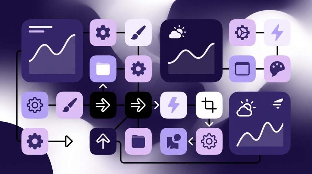
Shortcuts + Widgets + Icons: All Three Working Together
The real power in iOS 18 customization comes from stacking these features:
– A widget that shows you state or a list (tasks, notes, scenes).
– A Shortcut that performs the action you want.
– An icon or widget button that triggers that Shortcut.
Example: a “Deep Work” button.
1. Shortcut:
– Turn on a custom Deep Work Focus
– Turn off message banners
– Start a 90 minute timer
– Open a specific note or project
– Start a lo-fi playlist
2. Home screen icon: a minimal brain icon that runs that Shortcut.
3. Widget: a small Focus widget that shows which mode is active and lets you exit quickly.
Now your home screen holds a literal switch for a state of mind, not just an app.
Then vs Now: How Far Customization Has Come
To feel the jump properly, it helps to line up an old classic like the Nokia 3310 against a modern iPhone running iOS 18.
| Feature | Nokia 3310 (circa 2000) | iPhone with iOS 18 |
|---|---|---|
| Home screen | Static menu, text-based, no widgets | Multiple pages, widgets, stacks, Focus-based layouts |
| Customization | Ringtones, monochrome wallpapers, basic themes | Custom icons via Shortcuts, Focus-aware layouts, theme colors |
| Widgets | None | Interactive, lock screen + home screen, Smart Stacks |
| Automation | Alarm clock and maybe timed profiles | Shortcuts automations tied to time, location, apps, Focus modes |
| Shortcuts | Manual keypress sequences | Multi-step workflows across apps and smart home devices |
| Feel in hand | Chunky plastic, physical keypad clicks | Slim glass slab, haptic feedback mimicking buttons |
| Personality | Mostly ringtone and case choice | Visual design, behavior, automations, Focus modes |
We went from pressing actual rubber keys, each with a physical click, to pressing a sheet of capacitive glass that pretends to click back at you with haptics. Under that illusion, the logic has grown from “open message editor” to “run a complex routine across ten services.”
User Review from 2005
“Changed my operator logo to a tiny pixel skull. Now my phone looks ‘metal’ when it lights up. Friends are jealous.”
Rating: 5/5, “Best mod so far.”
Back then, that skull logo felt like a major customization win. Today, the equivalent flex is a phone that morphs its entire layout as you move through your day, with different widgets, icons, and Shortcuts available in different contexts.
Focus Modes: Different Phones On One Device
Focus modes became the quiet bridge between customization and behavior. In iOS 18, they turn your phone into a stack of personas.
Each Focus can now carry:
– A specific home screen or set of pages
– A custom lock screen
– Unique widgets and icon layout
– Notification rules
– Allowed people and apps
– Automation hooks via Shortcuts
So instead of one home screen trying to serve every life scenario, you get:
– Work Phone: calendar, tasks, Slack/Teams, workflow widgets, a Shortcuts icon to start meeting routines.
– Home Phone: photos, streaming, Home controls, health widgets.
– Travel Phone: wallet, boarding passes, translation tools, map widgets.
The same glass rectangle can feel like three different devices across a day, depending on which Focus you are in. It is both visual customization and functional gating.
Tying Focus to Shortcuts
Shortcuts can both respond to and trigger Focus modes. That feedback loop is where custom setups get interesting.
Examples:
– When Work Focus turns on:
– Apply a specific home screen layout
– Launch your project dashboard in a browser
– Post a Slack status automatically
– Start time tracking
– When you run a “Gym” Shortcut:
– Enable Fitness Focus
– Start a workout playlist
– Log the session
– Adjust Apple Watch settings
This is not just about tiles and colors. It is about binding actions and spaces together so your phone nudges you into the right mindset more often.
Practical iOS 18 Customization Scenarios
To ground all this, imagine a few real layouts and behaviors.
The Minimalist Productivity Layout
Goal: reduce clutter, surface only what moves your work forward.
– Lock screen:
– Big, readable clock
– Calendar widget with “Next event”
– Battery widget
– One Shortcut widget that runs “Start Work” routine
– Home screen:
– Large calendar widget at top
– Medium Reminders or to-do widget under it
– Two rows of Shortcuts icons: “Deep Work,” “Meetings,” “Admin,” “Break”
– Dock: browser, notes, messaging app, files
Behavior:
– 9 am automation: enables Work Focus, sets this layout, dims social app notifications.
– “Deep Work” icon: runs a Shortcut that starts a 90 minute session with Focus tweaks, playlist, and note template.
The customization here is not just visual. Widgets and icons are arranged by intent.
The Creator / Builder Layout
Goal: quick access to capture tools, drafts, and inspiration.
– Lock screen:
– Photos widget that surfaces “Inspiration” album
– Notes widget for quick voice memos or text
– Weather
– Home screen:
– Large Notes or writing app widget
– Shortcuts icons for “New Post Outline,” “Record Idea,” “Shoot B-Roll,” “Publish Checklist”
– Media players and file tools below
Shortcuts behind each icon:
– “New Post Outline”: opens your favorite editor, inserts a template, tags it appropriately.
– “Record Idea”: starts a voice memo, when you stop, transcribes it and sends it into a “Raw Ideas” note.
– “Shoot B-Roll”: launches camera in a specific mode, organizes clips into a set album.
Here, the customization turns your home screen into a production console, not just a door into apps.
The Smart Home Control Center
Goal: turn your phone into the front-end for a house full of devices.
– Lock screen:
– Home status widget: shows door locks, key sensor readings
– Power usage widget (if your system exposes it)
– A Shortcut widget “All lights off”
– Home screen:
– Large Home widget with main favorite accessories
– Medium widget for “Scenes”
– Row of Shortcuts icons: “Movie Mode,” “Away,” “Goodnight,” “Guests”
Behind the scenes, each icon might:
– Trigger a scene
– Change thermostat presets
– Adjust lamps based on time
– Notify you if a door or window sensor is out of expected state
Your phone becomes a remote for a building, not just for a TV.
The Feel of Control: From Plastic Keys To Glass Automations
Pull your memory back to old mobile devices for a second. The weight of a Nokia 3310 in your pocket, that dense, brick-like confidence. The hollow plastic snap when you popped off the back cover to change the battery. The way each keypress had travel and a little resistance, letting you type without looking.
Today, on an iPhone running iOS 18, the physical world is flatter: one big screen, one thin ring of aluminum or steel, solid glass front and back. The click you hear is virtual. The tactile feel is simulated. But in exchange for that physical simplicity, you get a software world that branches in thousands of directions.
Retro Specs: User Habits, 2004
“Got new operator logo, changed T9 dictionary to learn my slang, rearranged speed dial. Phone feels ‘mine’ now.”
Customization stack: ringtone + logo + speed dial order.
We are still chasing the same feeling: that this rectangular object reflects us, not just the company that made it. The difference is scale.
Where we once spent time nudging a ringtone onto a device, now we spend that time wiring widgets, icons, and Shortcuts so that our phone:
– Shows what matters without being asked
– Hides what distracts when you need to focus
– Responds to context like time, place, or motion
– Lets you trigger multi-step actions with a single tap
Maybe it is just nostalgia talking, but those old hacks trained a whole generation to push their devices a bit beyond the default. iOS 18 feels like the grown-up version of that same instinct, just spread across a glossy pane of glass instead of a monochrome dot matrix screen.
