
“The soft buzz of a Nokia 3310 on a wooden desk, that chunky vibration followed by the sharp ‘beep-beep’ of an SMS… and you actually wanted to pick it up.”
The funny thing is, that little brick never begged for your attention the way your phone does now. It just sat there. No color widgets, no red badges screaming for a tap, no stories expiring in 24 hours. You got a text, maybe a call, maybe a game of Snake. That was it. And somehow, you got through the day just fine.
Fast forward to the slab in your hand right now. OLED screen that glows like a mini billboard, 120 Hz refresh that makes scrolling feel like butter, apps tuned to grab your brain and not let go. You open your phone to check the time and wake up 20 minutes later on a random profile watching short videos of people cutting soap. You wanted information. You got a slot machine.
So when we talk about creating a distraction-free smartphone setup, we are not trying to be monks. We are trying to get a bit of that 3310 calm back without giving up maps, mobile banking, and the camera that makes your old compact digital look like a potato. A distraction-free phone today is not a dumb phone. It is a smart phone that acts a little less needy.
You remember the weight of those older devices, right? The Nokia felt like a pebble you could skip across a lake. The keys had that click, each press a clear confirmation. The screen had maybe 84 x 48 pixels. Nothing animated. Nothing sliding in from the side. Just text. Clear purpose.
Your current phone probably weighs around the same in grams, but it feels heavier in a different way. Mental weight. Notification pings, banners, badges, popups, alerts, widgets. Half of them are things you never asked for. But the hardware is not the enemy. The hardware is neutral. The enemy is the default setup that ships on these things, plus the habits we build around them.
So let’s treat your modern phone like an old-school device that just happens to have superpowers. Same way archivists treat a rare cassette: careful, intentional, protective of attention. We are going to look at how to strip your phone down, not literally, but mentally. Fewer triggers, more control. More “I use my phone” and less “my phone uses me.”
The nostalgia filter: what old phones got right
Before we tweak settings and bury apps in folders, it helps to remember what made older phones feel calmer.
“User review from 2005: ‘Battery lasts 4 days. No weird stuff. It just rings and texts. Perfect.'”
Those devices had some built-in limits that worked in our favor:
– The screens were small and low resolution. Bad for Netflix, good for not bingeing Netflix.
– No app stores. No endless feed. You had whatever the phone shipped with, maybe one or two simple games.
– Ringtones and alerts were fewer. A call, an SMS, maybe a calendar beep. That was it.
– There was no pull-to-refresh dopamine casino. Messages came in, you read them, life moved on.
Compare that to a top phone in 2025: OLED panel, almost zero bezel, camera cluster that makes you want to shoot everything, big bold icon grid that makes installing “just one more app” feel harmless.
Let us ground this in a quick Then vs Now comparison.
| Feature | Nokia 3310 (circa 2000) | iPhone 17 / modern flagship |
|---|---|---|
| Display | 84 x 48 px, monochrome, ~1.5 inch | ~2796 x 1290 px, OLED, 6+ inch, 120 Hz |
| Notifications | Calls, SMS, maybe calendar | System alerts, emails, chat apps, social, games, shopping, news, random promos |
| Main use | Calling, texting, Snake | Everything from banking to entertainment to work to health |
| Distraction risk | Low | High by default, unless tuned |
| Control over alerts | Basic ringtone & profile selection | Per-app notification control, focus modes, screen time tools |
The irony: modern phones are loaded with features that can protect your attention, but the default experience rarely encourages you to use them. The tools are there. They are just buried under a pile of icons and auto-enabled alerts.
So the goal is to recreate the clarity of a Nokia-style experience with the control of a modern OS. Less feed, more function. Less “look at me” and more “I am here when you need me.”
Step 1: Treat your phone like a tool, not a toy
Think back to that first flip phone you had. Remember that satisfying snap when you closed it? That physical action told your brain: “Call is over. Conversation done.” The hinge was a boundary.
Your current phone has no hinge. It is always “soft open.” The home screen is one tap away from a feed that never ends. So the first mindset shift is simple: your phone is a tool you pick up with a clear reason, then put down again.
You can even ask a simple question each time you unlock: “What am I here to do?” Not as some self-help mantra, just as a quick filter. Check maps. Message someone. Approve a payment. Look up a location. Done.
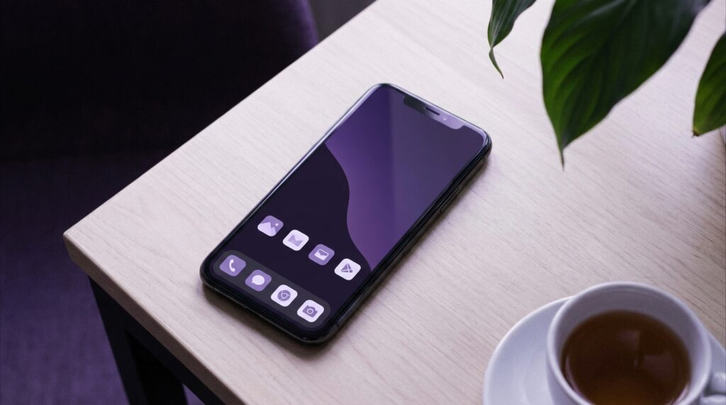
To make that mindset stick, you need a home screen that matches it. If your first screen is a carnival of color and icons, your brain gets micro-tempted every single time you unlock.
We will fix that. But before we do, let us borrow something from the old days again.
“Retro specs: The Motorola V3 Razr had a 2.2 inch internal screen. You rarely stared at it unless you were doing something. No idle scroll habit, because there was nothing to scroll.”
That is what we want: an idle phone, not an idle scroll.
Step 2: Build a calm home screen
Choose a boring background on purpose
Those default live wallpapers look nice in a store. On your own device, they act like a neon sign you see 200 times a day. A distraction-free setup starts with visual calm.
Pick a plain photo. Solid color. Soft gradient. A simple pattern. Something that does not shout at your eyes. The goal is not aesthetics for their own sake. The goal is less visual noise, less emotional reaction every time the screen wakes up.
Some people swear by a black wallpaper on OLED phones, both for battery and for minimal glow. Some prefer a muted grey or off-white that feels like paper. Try one for a week and notice if your unlocks feel less “exciting” and more neutral.
One home screen, not five
Old feature phones did not have multiple pages of icons. You hit Menu, you got a list. That constraint helped. On a modern phone, having 5 screens of icons is like having 5 desks covered in papers. You will bump into things you never meant to open.
Collapse everything to one home screen. Put anything non-essential off that main grid. On iOS, that might mean moving apps to the App Library. On Android, you can keep them in the app drawer. If an icon is not on the front screen, you must search or scroll for it, which adds a sliver of friction. That friction helps.
Your main screen should answer this question: “What do I actually use every day that supports the life I want, not the habits I complain about?”
The “only what matters” icon setup
You can think in simple buckets:
– Communication you truly need: messages, phone, maybe one work chat.
– Utilities: maps, camera, calendar, notes, banking.
– Health or habit support: maybe one focus app, timer, or meditation tool if you actually use it.
No social shortcut. No games. No shopping icons. Those can live off the main screen or be uninstalled.
Keep the dock extra strict. Dock is prime real estate. On many phones it appears on every home screen, so whatever you place there might get 10 times more taps. You want your most deliberate apps there, not your most addictive ones.
Step 3: Turn notifications into a whitelist, not a flood
Think of your old Nokia again. It never said, “Your friend just liked someone’s post.” It rang for a call. It beeped for a text. That kind of alert had real meaning. It mapped to real people.
Modern notifications are like pop-up ads sneaking into your personal life. A clean, distraction-free setup means your phone only interrupts you when a human or a clear, high-priority system event is involved.
“User review from 2005: ‘I miss one thing: more ringtones. But I like that my phone doesn’t bother me unless someone actually wants to talk to me.'”
Borrow that rule. On a modern smartphone, that usually means:
– Calls from real contacts.
– Messages from close people.
– Calendar reminders you depend on.
– A small set of critical alerts: bank transactions, delivery, ride arrival.
Everything else either gets silenced, turned into silent banners, or disabled entirely.
If that sounds harsh, remember: you can still open any app and see things when you want. You are not cutting yourself off. You are just ending the open-door policy that lets apps shout at you anytime they feel like it.
Use focus modes like old-school profiles
Remember “Silent”, “Loud”, “Meeting” profiles on older phones? You pressed a button, picked a mode, and the whole device switched behavior. That was primitive compared to modern Focus or Do Not Disturb, but the spirit was the same.
On iOS and Android, you can create focus modes that:
– Allow calls only from favorites.
– Allow notifications only from a shortlist of apps.
– Dim or hide specific home screens.
– Change lock screen behaviors.
Think like this:
– Work focus: only email, work chat, calendar, banking alerts, family calls.
– Home focus: messages, calls, smart home apps, music.
– Deep work / study: maybe just calls from close family, timers, one note app.
The key is to avoid a million overlapping rules. Keep each mode simple. Reuse the same contact lists where possible. Set schedules if that helps, or toggle manually.
Silence but keep badges where needed
Sometimes you still want to see that you have unread things, just not hear or feel them. Silent notifications plus badges can strike a middle ground.
For example:
– Email: silent, badge on. You see there are 12 new emails when you decide to check. The phone does not vibrate for each one.
– Messaging: maybe keep sounds for a small group (family), silence everything else, but allow badges for them.
Think of sound and vibration as premium channels. Only real-time, high-impact events should get that channel.
Step 4: Remove the feed from your line of sight
Most distraction comes from apps built around infinite scroll. You know the ones. You open them for “just a second” and the next moment you are watching a remix of some clip from ten years ago, in 4K, with auto-generated subtitles.
Plain truth: a distraction-free setup usually means these apps move off your main screen, and often off your phone.
That does not mean you never use those services. It just means you choose when, where, and how.
Some simple moves:
– Delete the app, use the site in a browser. The friction of the browser slows down the habit.
– Keep the app installed but signed out. Log in only when you have a clear purpose.
– Move it to the last page, inside a folder with a name that reminds you of the habit, like “Time Sink”. Not as a shame label, but as a pattern interrupt.
If you want to get more deliberate, you can compare how social or media apps used to work.
| Feature | Early social / MMS era | Modern feed apps |
|---|---|---|
| Content length | Short texts, small images, limited by MMS costs | Endless video streams, autoplay stories, long threads |
| Access friction | Open messaging or WAP browser, pay per KB | One tap from home, always logged in, background refresh |
| Attention design | Simple lists, static pages | Infinite scroll, variable rewards, highly tuned algorithms |
| Default use case | Check in on a friend, send a photo | Fill any small gap in attention |
That last row is the one that bites. Old phones did not try to fill every bored moment. New apps are wired for that. Your setup needs to push back.
Step 5: Make friction your quiet ally
In the days of T9, typing itself slowed you down. You would think hard about a sentence before pressing each key multiple times. That friction reduced spammy messages from you to others. It also stopped you from wandering into complicated searches for no reason. It was too much work.
Now keyboards are fast, voice input is one long press away, and your thumb can open any app instantly. So you need to add back friction where it helps.
Some simple ways:
– Remove biometric unlock for selected apps that distract you. Use a PIN instead. That extra step gives you time to ask, “Do I really want to open this right now?”
– Disable “pull to refresh” in apps that allow it, or use their time-based limits if they offer those options.
– Turn off auto play for videos where possible.
You can also go further and use app timers. Not as a shame tool, but as a soft cap. For instance, 15 minutes of short-video scrolling per day. When the timer hits, the app locks or warns you. You can override it, but that conscious override is the friction that breaks the automatic chain.
Step 6: Physical and sensory tweaks that change behavior
Older phones talked to you through simple cues. Single-tone ringtones, small vibration motor, a backlight that timed out quickly.
Modern phones come with a huge range of haptics, tones, and screen behaviors. You can use that range in your favor.
Vibration and sound rules
Try this tiered system:
– Calls from favorites: ring + vibration.
– Other calls: vibration only.
– Messaging from close people: soft sound, maybe a distinct tone.
– Everything else: silent, or silent + badge.
You can also set specific tones for important contacts, much like people did with ringtones back in the 2000s. That way, one small sound tells you not just “phone” but “this person.”
Again, we are going old-school: your phone should sound different for different levels of importance, not blast the same chirp for a random app update and your partner calling from the airport.
Screen behavior
That glow when a notification lights up your phone is one of the biggest triggers. If the screen lights for every random alert, your attention splinters. Instead:
– Disable “wake screen on notification” for most apps.
– Keep that behavior for calls and selected messaging apps only.
– Reduce auto-lock time, so the phone sleeps quicker.
You can even use grayscale mode at certain hours. Some old-school power users run their phone in black and white at night. Color is enticing. Kill the color, and many apps feel less sticky.
Step 7: Build one “focus mode” home screen
Remember feature phones had simple menu trees? You knew: left key for contacts, right key for messages, center for menu. Muscle memory kept it simple.
You can mimic that with one special home screen that appears during your focus mode, containing only the tools that match the type of work or time you are in.
For example, a work focus home screen might show just:
– Calendar
– Email
– Work chat
– Docs app
– Browser
– Notes
– Clock / timer
No social, no games, no shopping. When that focus mode is active, other screens stay hidden. When work time is over, switch to a different mode where your home screen might show:
– Messages
– Music
– Photos
– Smart home
– Health
You are not fighting willpower every second. You are changing the environment so willpower gets a break. The same way you might leave an old PSP in a drawer until you really want to play, you are hiding your digital toys behind a context that fits your current life segment.
Step 8: Use old habits to build new boundaries
There is a good chance you still remember how you used to treat phones before they became everything devices. Many people left them on desks, in bags, by the door. You did not walk from room to room glued to a T9 keypad.
You can reintroduce that physical boundary:
– Phone lives on a table or dock during focused work.
– Phone does not go to bed with you.
– Phone stays out of the bathroom. That one is self-explanatory.
It sounds almost silly, but your body and brain take cues from location. Charging dock in the hallway at night, for instance, sends a clear signal: “This thing sleeps too.”
Combine that with settings:
– Night focus mode that blocks everything except urgent calls.
– Reading mode for late-night screen use, or, better, no screen in bed.
Remember when your biggest nightly distraction was the green backlight of a Nokia screen while you checked one last message? That constraint was healthy. You can simulate a version of it by deciding where your phone physically spends its time.
Step 9: Archive thrills, keep tools
This blog lives at the intersection of mobile history and modern tech. So it helps to think of your apps like an archivist sorting hardware on a shelf.
On one side: gadgets you keep because they spark joy. That old Sony Ericsson with the walkman logo, the Game Boy Micro you sometimes bring out on flights. You do not keep them in your main workspace, though. They live in storage until you decide it is playtime.
Your phone can mirror that:
– “Archive” folder for games and pure entertainment apps.
– “Tools” front and center: maps, transport, banking, messaging, camera, notes.
You are not banning fun. You are filing it on the right shelf.
“Retro specs: The Sony Ericsson K750i packed a 2 MP camera with autofocus. People loved that they did not need to carry a separate digital camera every day. It was a tool upgrade, not a full-blown portable casino.”
Modern phones merge tool and toy into a single glossy rectangle. Your job is to separate those roles again at the software level.
Step 10: Track how it feels, not just how it measures
Screen time stats are helpful, but they do not tell the whole story. You could spend two hours on your phone reading a long article or learning a language, and feel fine. Or you could spend 20 minutes bouncing across five apps and feel drained.
A distraction-free setup is successful when your phone feels lighter. Less drag when you pick it up. Less guilt when you put it down. Maybe more moments when you forget where it is for a while.
Pay attention to:
– How often you unlock just to “check something” with no clear aim.
– How many times you find yourself on a feed without remembering how you opened it.
– Whether you feel jumpy when you hear any generic notification tone.
If you miss a bit of noise, you can slowly reintroduce certain alerts. If you still feel overwhelmed, keep stripping.
Putting it side-by-side: a distraction-heavy vs distraction-free setup
To make this concrete, here is a quick Then vs Now style comparison, but this time for your own phone setup.
| Aspect | Default modern setup | Distraction-free setup |
|---|---|---|
| Home screen | Multiple pages, bright wallpaper, all apps visible | Single screen, muted wallpaper, tools only |
| Notifications | Most apps allowed, sounds + vibrations | Whitelisted apps only, sound/vibration reserved for key contacts |
| Social/media apps | Dock or first page, always logged in | Hidden, in folders, or used via browser with sign-in friction |
| Focus modes | Disabled or basic DND at night | Custom modes for work, home, deep focus, each with tailored home screens |
| Physical habits | Phone in hand or pocket at all times | Phone parked on desk, hallway table, or dock during set times |
| Emotional feel | Always “on call” for apps | Reacts mainly to humans and real events |
Maybe it is nostalgia talking, but phones felt more honest when they buzzed only for things that had weight. Creating a distraction-free setup is really about getting back to that feeling with far better hardware and way more power in your pocket.
You keep the sharp camera, the rich audio, the GPS that does not make you print MapQuest directions. You just strip out the part where every single app tries to act more important than it really is.
