
“That faint vibration from a Nokia 3310 on a wooden table, the tiny monochrome screen lighting up with ‘1 new message’… and somehow, that single buzz felt calmer than the flood of notifications your phone throws at you every 5 minutes today.”
You remember that sound, right? Back then, your phone was a gadget, not your entire life. You could slip it in your pocket, feel the weight of that chunky plastic brick, know it would survive a fall down the stairs, and still walk away from it without worrying about unread emails, doomscrolling, or streaks. Now your phone is brighter, sharper, thinner, and a thousand times more distracting. That is where digital wellbeing apps come in. They are our modern answer to the old-school “phone-off-in-the-drawer” approach, but with far more control, data, and, if you set them up right, less guilt.
The funny part: we went from staring at T9 keys and 84 x 48 pixel screens to 120 Hz OLED panels that almost feel too smooth, too responsive. The hardware grew up. Our habits, not so much.
You probably do this: unlock your phone to check one notification, then 20 minutes vanish into Instagram Reels, Reddit threads, or Slack messages. You set your own trap with that glossy slab of glass and metal, and your apps help spring it. Digital wellbeing tools try to reverse that logic, turning your phone into the thing that nudges you to stop using your phone.
Maybe it was just nostalgia talking, but there is a kind of peace in the memory of an old flip phone snapping shut. A hard plastic signal that said: “Conversation over. Screen off.” No soft haptic tap, no half-hearted “Do Not Disturb” bubble. Just a physical closure.
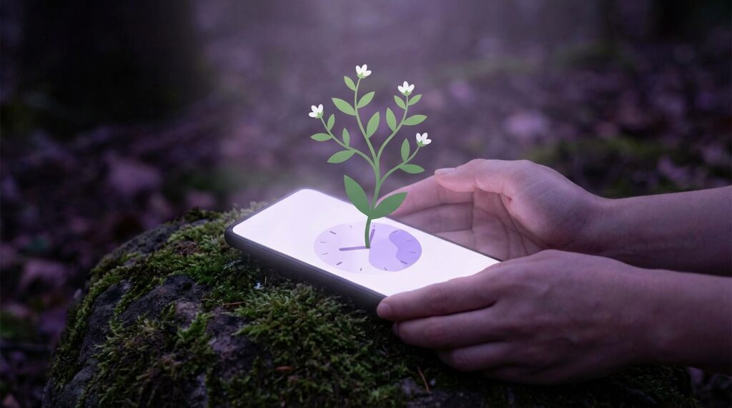
Now we fake that closure with app timers, greyscale modes, and focus profiles. And when they work, that feeling of control is strangely similar to slipping your old phone into your bag and going outside, unreachable for a while.
The long road from ‘always available’ to ‘too available’
If you hold a Nokia 3310 today, it feels like a toy. Rounded blue plastic, rubbery buttons, a tiny window of a screen. No color, no animations, no infinite scroll. Yet that device already started the idea that you could be reachable all the time. It just limited what “reachable” meant. Calls. SMS. Maybe Snake if you were bored in class.
Then came polyphonic ringtones, color displays, then the first cameras. Each step edged the phone closer to being a general-purpose screen. Ringtones turned into MP3s. The grainy VGA camera became a 2 MP shooter, then 5 MP. Little by little, the phone stopped being a quiet background object and became a portable entertainment hub.
Then the iPhone showed up. And the real shift was not the capacitive touchscreen or the glossy glass. It was the App Store. Suddenly every part of life tried to squeeze itself into that 3.5 inch display. And every app had one goal: keep you in the app.
No one designed a Nokia 3310 to hijack your attention. They designed it to get a signal in weak coverage and last a week on a charge. With smartphones, engagement turned into a metric. Notifications, red dots, infinite feeds, autoplay. All nudging your brain.
Digital wellbeing tools try to pull your brain back out.
The first crude “digital wellbeing”: silent mode and airplane mode
Before Android had a “Digital Wellbeing” dashboard and before iOS started shaming you with Sunday Screen Time reports, the only real control was that little bell icon. Silent mode, vibration, or power off. Those blunt tools worked because life was still mostly offline.
Powering off a Nokia or Motorola was a clear cut. That chunky removable battery and physical power button gave you a real on/off state. No background tasks. No “maybe it’s still syncing.” Just dark screen, no signal.
Now your phone whispers: “Are you sure you want to shut down?” Then it takes a few seconds. You know alarms might not work. You know you might miss that one urgent message. So you rarely shut it off completely.
That gap between full-on and full-off is exactly where modern digital wellbeing apps live. They give you in-between states: fewer notifications, time limits, focus modes, lockout screens. Not everything. Not nothing. Something in the middle.
Retro specs vs modern screen-obsessed life
To really feel how far we have moved, it helps to compare the old “always on you” device with what sits in your pocket now.
“Retro Specs: Nokia 3310, 133 g of indestructible plastic, 84 x 48 pixel screen, 900 mAh battery, and pretty much zero reason to stare at it for hours unless you were addicted to Snake.”
Today, your flagship smartphone weighs less or about the same, yet gives you a 6+ inch display, 120 Hz refresh, HDR, and a full desktop’s worth of apps. And battery life, even at 4000-5000 mAh, somehow feels worse because the screen never stops asking for attention.
Here is a quick then vs now snapshot:
| Feature | Then: Nokia 3310 era | Now: iPhone 17 / modern flagship |
|---|---|---|
| Screen size | 1.5 inch approx, 84 x 48 pixels, monochrome | 6.1-6.8 inch OLED, ~2550 x 1179 or higher, color, HDR |
| Refresh rate | Static LCD, no animations | Up to 120 Hz adaptive, ultra smooth animations |
| Primary use | Calls, SMS, Snake | Social feeds, streaming, messaging, work, smart home control |
| Battery life | Up to 7 days standby, multi-day light use | ~1 day with mixed heavy use |
| Notifications | Calls, SMS, maybe 1-2 extras | Dozens of apps, push alerts, badges, widgets |
| Distraction level | Low. Boredom required effort. | High. Boredom is almost impossible near the phone. |
| Built-in wellbeing tools | Silent, power off | Screen Time, Digital Wellbeing, Focus modes, app limits |
We went from a device you had to work to use, to one that works very hard to use you. So apps that help reduce screen time are not about hating tech. They are about clawing back the quiet parts.
Built-in digital wellbeing apps: the “OS-level” guardians
Both iOS and Android ship with their own screen time managers baked into the system. They sit closer to the operating system than third-party apps can, so they can lock you out more reliably and track usage across more apps.
Apple Screen Time: the weekly report that stings a little
On iPhones and iPads, Screen Time lives in Settings. It tracks:
– Total screen time per day
– Time by app
– Unlocks and notifications
– Categories like “Social”, “Productivity & Finance”, “Entertainment”
You know that Sunday evening summary. It pops up with something like “Your screen time was up 23% this week.” A tiny digital judgment. Maybe you shrug. Maybe you feel called out.
Under the hood, the specs are not about pixels or gigabytes, but behavior:
– App Limits: You set 30 minutes for Instagram, 1 hour for YouTube, whatever fits your goals.
– Downtime: A schedule when only allowed apps work. Think “10 pm to 7 am = calls and messages only.”
– Always Allowed: Emergency apps that bypass Downtime and limits.
– Content & Privacy restrictions: More for kids, but also handy if you want to lock yourself out of installing new distractions.
The key thing: Screen Time can gray out app icons, hide notifications, and throw a full-screen block when you hit a limit. You can ignore it, tap “Remind me in 15 minutes,” enter your passcode, and cheat. But now you have to consciously break your own rule. That small friction matters.
“User Review from 2019: ‘Screen Time did not magically fix my phone habits, but the moment I had to type my passcode just to open Instagram after 11 pm, I started asking, do I really need this right now?'”
That question, triggered at the right time, is often the whole point.
Android Digital Wellbeing: the dashboard and the wind-down
On most modern Android phones, Digital Wellbeing lives in Settings, with a similar feature set:
– Dashboard: App timers, daily usage visuals, unlock counts.
– Focus mode: You pick distracting apps. It pauses them during your focus sessions.
– Bedtime mode: Enables Do Not Disturb, optional greyscale, and dims your wallpaper.
Different Android manufacturers tweak the look and add extras. For example:
– Google Pixel: “Heads Up” that reminds you to look up when walking while using your phone.
– Samsung: Separate Work and Personal profiles that keep work apps out of sight on weekends.
App timers on Android are brutally simple: hit 0 minutes and you get a toast saying “You have reached your limit.” The icon greys out. You can remove the limit, but again, that action exposes your own choice.
What both Screen Time and Digital Wellbeing share is this: they are not trying to diagnose you. They show numbers, give you switches, and leave the decision to you. That is both their strength and their weakness.
Third-party apps that go beyond the basics
Built-in tools are a good start, but they tend to stay quite plain. Third-party apps try to add extra layers: behavior design, gamification, visualisations, even trees.
Forest: growing trees by not touching your phone
Forest is one of the most talked about screen time helpers, especially among students. The idea is charmingly simple:
– You set a timer, say 25 minutes.
– Hit start, a virtual tree starts to grow.
– If you leave the app to scroll social media, your tree withers.
– If you stay focused, your tree grows and joins your digital forest.
Specs and mechanics:
– Focus durations: From short sprints to longer deep work sessions.
– Tags: “Study”, “Reading”, “Work” so you can see where your focus time goes.
– Streaks and achievements: For consistent focus days.
– Optional whitelist mode: Let certain apps through, like a dictionary or note app.
The phone still weighs the same in your hand, the glass still feels smooth, but you connect that physical urge to unlock with a visual loss: a dying tree. It is almost childish. That is exactly why it gets into your head.
“User Review from 2017: ‘I started with it as a joke, but once I killed my first tree just to check Twitter, I felt oddly guilty. After that, I started treating my focus sessions like real appointments.'”
For many people, Forest does not reduce overall phone use overnight. It creates little protected islands of offline focus inside a sea of distraction. That is often where habit change starts.
Freedom and Cold Turkey: blocking at the network level
If app-level timers are not enough, tools like Freedom (cross-platform) and Cold Turkey (on desktop, some mobile support) raise the stakes.
What they do:
– You select websites and apps to block, like Instagram, YouTube, gaming sites.
– Set a schedule or start a manual session.
– While active, your device cannot access those sites or apps. In some modes, even rebooting does not help.
Freedom, for example, runs a VPN-like system that intercepts network requests and cuts them off. You hit YouTube, you get nothing. The app can also sync across devices, so your laptop cannot quietly cover for your phone addiction.
Specs in practice:
– Sessions configurable from a few minutes to several hours.
– Recurring schedules: “Block socials every weekday 9 am to 5 pm.”
– Locked mode: Harder to cancel sessions once started.
The feel is very different from Screen Time’s gentle “time’s up” popup. It is more like trying to open a locked door. No drama, just a firm “no.”
RescueTime, StayFree, and usage trackers: the stats nerd’s toolset
Some of us change behavior better when we see hard numbers. RescueTime (desktop and older Android setups), StayFree (Android), and similar apps dig deeper into stats.
Features usually include:
– Detailed hourly breakdowns: not just “2 hours of social”, but which app, when, how often you switched.
– Focus scores: A simple metric that rates how focused your day looked based on categories.
– Alerts: “You have spent more than 1 hour on YouTube today.”
These tools often feel less like parental control and more like a fitness tracker. Your phone habits become data you can tweak.
On Android, StayFree reads usage stats from the system and presents them in clean graphs. On iOS, system limits on background tracking mean you stick mostly with Apple’s own Screen Time, but you can still sync some stats from Mac or browser plugins, or use focus timers that log sessions.
Greyscale, widgets, and layout hacks: low-tech, high impact
Not all digital wellbeing tools are apps. Some are just smart ways to use settings and layout.
Greyscale mode: turning your phone into a boring tool
Color is a huge hook. Red notification badges, bright app icons, autoplay thumbnails. When you switch your phone to greyscale, everything looks dull. That is the point.
Most phones tuck this feature inside accessibility or bedtime settings. Once on:
– Photos still look fine enough to check content, but lose that vivid pop.
– Social feeds look like bland walls of text and grey blobs.
– Bright app icons no longer call to you from the home screen.
This single toggle can cut “just for fun” checking significantly. It does not block anything, yet your brain feels less rewarded when you swipe.
Many people connect greyscale to a schedule, like 9 pm to 7 am, so evenings drift more toward reading or conversation. Some go full hardcore and leave greyscale on all day, only switching back when editing photos or watching a movie.
Home screen minimalism: hiding the candy
Back in the early smartphone days, you probably filled your home screen with everything. Colorful grids, folders, widgets. It felt powerful.
For digital wellbeing, you flip that idea:
– First page: only tools. Phone, messages, maps, calendar, maybe a notebook or camera.
– Second page or App Drawer: all the social and entertainment apps, preferably in a folder.
– No notification badges for social apps.
Now, each time you unlock your phone, your eyes land on a calm, mostly empty screen. To get to Instagram, you swipe, tap a folder, then tap again. That extra second is often enough for your conscious brain to catch up and ask, “Wait, why am I doing this?”
None of this requires third-party apps. It just uses the flexibility the OS already provides.
How these tools actually change behavior
The tech behind digital wellbeing is not very complex compared to camera processing or AI features. App timers, network filters, greyscale toggles. Low-level settings with a bit of UI.
What matters is how they interact with human habits.
The micro-friction principle
Think about the old T9 keypad. Typing a long SMS on that tiny plastic grid took effort. You had to press keys multiple times, feel the raised bumps under your thumb, glance at the pixelated letters. That friction limited how long your messages were. You still sent heartfelt texts, but you did not write novels.
Modern keyboards are instant. Predictive text, swipe typing, voice input. Friction nearly vanished. That means we type more. It also means texting or tweeting becomes the default reaction.
Digital wellbeing tools reintroduce friction into the points where you do not notice your own habit. Some examples:
– Having to tap “OK” to start another 15 minutes on TikTok.
– Watching a greyscale, empty home screen instead of a wall of icons.
– Hitting a blocking screen when you try to open YouTube during your focus block.
These small speed bumps give your slower, more reflective brain a chance to weigh in before the habit completes.
Visibility and shame, in a good way
When Screen Time shows that you spent 4 hours on your phone today, including 1 hour on one app, the number itself is not magic. But it replaces the vague “I am on my phone too much” feeling with a clear metric.
For some people, that number triggers guilt. For others, curiosity. Both can push change. You might decide to shave 30 minutes off. You might set an app limit slightly below yesterday’s usage.
The trick is to treat those stats like health metrics, not moral judgment. You are not “bad” for 4 hours of screen time. But if those 4 hours crowd out sleep, reading, or in-person time, then they are not matching your actual goals.
Externalizing control: making your future self the boss
Back when phones had removable batteries, you had a crude but effective trick: pull the battery, toss it in a drawer, and you were unreachable. Now, sealed designs and more complex software make that less practical.
Digital wellbeing apps become your programmable future self. At 11 pm, Past You has already decided that Future You should not browse social media. So Downtime kicks in. Future You can break the rule, but has to fight for it.
This externalization matters if you struggle with impulse control in the moment. You are letting a calmer version of yourself write the rules when you are not stressed, tired, or bored.
Combining tools for different types of screen time
Not all screen time is equal. Scrolling short videos at 1 am feels different from reading a Kindle book or working on a presentation. So the smartest move is often to mix tools by context rather than going “all or nothing.”
Work hours vs off hours
During work time, the goal usually is:
– Keep communication channels like email, Slack, or Teams open.
– Reduce social media and random browsing.
– Preserve focus blocks.
A sample stack:
– OS-level Focus / Do Not Disturb: Only work apps and VIP contacts can send notifications.
– Freedom or similar blocker on laptop and phone: Block socials, news, and video sites 9 am to 12 pm, 1 pm to 5 pm.
– Forest sessions: 25 or 50 minute focus cycles with short breaks.
Here, you are not reducing total screen time massively. You are shifting it: more active work, less passive consumption while on the same device.
Evenings and sleep
Late-day screen time tends to attack sleep. The bright OLED, the blue light, the emotional hooks from social feeds or tense shows.
For this context:
– Bedtime mode / Wind Down: Dim screen, enable greyscale after a set hour.
– App limits: Hard caps on apps most likely to keep you up: streaming, infinite scroll.
– Physical move: Charging phone outside the bedroom if possible.
You might not shave off hours right away, but you often squeeze the doomscroll window into a shorter, more conscious slot, then transition to something calmer like reading on a dedicated e-reader or paper book.
Weekends and social time
This is closer to the old feature phone vibe. You probably want:
– Calls, messaging, maps, camera.
– Minimal work or social media intrusion during family or friend time.
Stack could look like:
– Weekend Focus mode: No work emails or Slack from Friday night to Monday morning.
– Hidden work apps: Move work-related icons off the main pages.
– Manual rules: Physical basket or drawer for all phones at meal times.
Again, some people add strong blockers. Others get enough benefit from just silencing notifications and hiding icons.
What about kids, teens, and shared devices?
Digital wellbeing gets far more sensitive with children and teenagers. Parents remember growing up with limited screens, but their kids are born into a touch-first world.
Here, OS-level tools really matter because they support supervised accounts:
– Family Sharing on iOS: Parents can set Screen Time limits, approve app downloads, block explicit content.
– Google Family Link: Similar oversight on Android and Chromebooks.
Specs of supervised digital wellbeing:
– Daily and app-specific time limits that children cannot change without permission.
– Bedtime windows where the device locks most apps.
– Reports to the parent account.
The challenge is balance. Locking everything tight usually backfires. Kids find workarounds, resent limits, or sneak in screens elsewhere. The sweet spot tends to be:
– Joint goal setting: Talking about why certain limits exist.
– Shared dashboards: Reviewing usage together weekly.
– Slowly expanding freedom as trust and self-control grow.
The goal is not to recreate a 3310 childhood. That world is gone. It is to help them grow toward healthy habits faster than we did, using tools we had to invent on the fly.
The hardware feel vs the habit feel
If you line up your old phones on a table, you can trace your own digital wellbeing story in physical form.
– The thick, rubberized shell of the 3310.
– The satisfying snap of a Motorola Razr hinge.
– The glass and aluminum slab of your first iPhone.
– The current nearly bezel-less rectangle that feels more screen than object.
“Retro Specs: Motorola Razr V3, 95 g, razor-thin flip body, T9 keypad with metallic click, 176 x 220 color display that seemed rich at the time, but showed visible pixels if you looked closely.”
These designs shaped how you interacted with them. The Razr encouraged short, punchy calls and texts. The hinge itself created a “session.” Open to engage, close to disconnect.
Modern phones have almost no moving parts. Taps and swipes replaced mechanical cues. Sessions blur together. You pick up your phone planning to check the time, and 15 minutes later you are on your third social app.
Digital wellbeing apps try to create digital equivalents of that old hinge:
– Focus sessions with clear start and end.
– Bedtime cutoffs.
– Timers that shrink the scope of each browsing burst.
Maybe it is nostalgia, but the goal feels similar: phones as tools you pick up for a reason, then put down when you are done.
Practical setup: a sample digital wellbeing “stack” for 2026
Let us pull this together into a concrete configuration that many people find workable. You do not need every app mentioned, but this gives a feel for how they can fit.
On iPhone
– Screen Time:
– Total social apps (Instagram, TikTok, Twitter/X, Snapchat, Reddit) capped to 1 hour per day.
– Downtime from 11 pm to 7 am. Only Phone, Messages, Maps, Notes allowed.
– Focus modes:
– Work Focus: 9 am to 5 pm, weekdays. Allow work apps and calendar notifications; silence social.
– Personal Focus: Evenings. Block work email and Slack.
– Layout:
– First home screen: Phone, Messages, Camera, Calendar, Notes.
– Social apps moved to second screen in a single folder without badges.
– Visual:
– Night Shift or True Tone on.
– Greyscale tied to Downtime.
Optionally, add:
– Forest for timed study or deep work blocks.
– Freedom on Mac and iPhone to cover browser-based distractions.
On Android
– Digital Wellbeing:
– Dashboard-based app timers: 30 minutes per major social app.
– Bedtime mode: 10:30 pm to 7 am, greyscale and Do Not Disturb.
– Focus mode:
– Two sets: “Work” to pause social apps, “Study” to pause everything except note-taking and reading.
– Layout:
– Minimalist launcher setup with no social apps on the main page.
Optionally:
– StayFree for detailed stats and history.
– A network blocker like Freedom that syncs with desktop.
None of this gives you a retro phone body. Your device still has insane pixel density, bright colors, and smooth scrolling. But the software scaffolding reshapes how often you let all that come at you.
What has not changed: your brain on notifications
From the first ringtone-packed feature phones to today’s notification centers, one thing stayed remarkably consistent: the spike you feel when your device calls for you.
On a 2005-era Sony Ericsson, a new SMS came with a chime and maybe a tiny envelope icon. It was special because it did not happen that often. Each buzz felt like a real event.
“User Review from 2005: ‘I love my K750i, but my friends say I text too much. I get maybe 30 messages a day, which feels like a lot. The vibration on the table keeps making me check it.'”
30 messages a day now sounds gentle for many people. A single group chat can hit that in an hour.
Yet your nervous system is still wired for scarcity. Every ping still carries a little reward. Digital wellbeing apps do not change that wiring directly. They simply cut down the number of pings and raise the bar for each check.
Fewer notifications plus structured access equals fewer phantom vibrations, less compulsion, more stretches of genuine focus or rest.
And that is probably the biggest win: not throwing out your phone, not trying to live like it is 2003 again, but bending the tech just enough that your nervous system can catch a breath.
