
“That tiny ‘click’ when you locked the original iPhone screen, like a miniature door shutting on the old phone world.”
You remember that sound, right? Not a hardware click, not a sliding mechanism, just a short digital lock noise coming from a slab of glass and aluminum that somehow felt more like a portal than a phone. Before that moment, a “phone” was still judged by its keypad, its antenna, and how well you could send an SMS with your thumb. After that moment, the idea of a phone started to feel wrong. This thing in your hand was closer to a pocket computer that happened to make calls on the side.
When Apple showed the first iPhone in 2007, it did not just compete with Nokia, Motorola, or BlackBerry. It quietly changed what the word “phone” even pointed to. You can feel it today every time you unlock a modern device with your face, swipe between smart home apps, or stream lossless audio from your pocket to speakers across the house. That old 3.5 inch, 480×320 screen is wired into your smart thermostat, into the way you order food, into how you back up photos to the cloud without thinking. The jump from “phone” to “handheld control center for almost everything” starts at that first iPhone keynote.
Before the iPhone, mobile design felt like walking through a mall of tiny hardware experiments. There were candybars with physical T9 keypads, sliders that revealed numeric keys, flip phones with satisfying clacks, phones with pull out antennas that wobbled a bit if you shook them. The average device had a low resolution screen that washed out in bright sunlight, made from plastic that picked up scratches from car keys in your pocket. Menus were layered like an old office filing cabinet: Messages in one branch, Settings in another, ringtones buried under three or four soft key presses. Each brand built its own little universe.
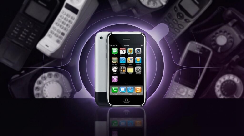
The first iPhone sliced through all of that with a glossy black rectangle that almost felt wrong to hold at first. No physical keyboard. No stylus. Just a single Home button that felt like it might be too simple for its own good. You looked at it and wondered: “How am I supposed to text on that?” Then you started using the multi touch screen, pinching to zoom in on a web page, gently flicking a list so it scrolled with that elastic bounce at the end, and the question flipped in your head to: “How did we ever put up with those old menus?”
The thing weighed about 135 grams, had a solid heft that felt heavier than its size suggested, part metal, part glass, with a slightly curved aluminum back that pressed nicely against your palm. The 3.5 inch display did not sound huge on paper, but compared to tiny Nokia and Motorola screens filled with jagged fonts, it felt like someone glued a mini cinema to a phone shell. The bezels were thick by today’s standards, but around 2007 that border made it feel framed, like you were looking into a focused window on the internet, not just checking a device.
The World Before “iPhone” Meant “Default Computer”
“Retro Specs: ‘My Nokia 3310 survived drops from the second floor. The snake game was still smoother than the web browser on my new PDA.'”
If you grew up with early 2000s phones, your pockets probably cycled through a weird mix of gear. A sturdy Nokia 3310 with that famous swappable cover and monochrome screen. Maybe a Sony Ericsson with a joystick nub for menu navigation. A Motorola RAZR that felt razor thin at the time, with its metallic keypad and slim profile that fit into even the tightest jeans.
Most phones then were about three core things: calls, text, and maybe some simple extras like polyphonic ringtones or a basic camera. Web on a phone was an afterthought. WAP pages, tiny stripped down sites that felt like text files pretending to be the internet. Data speeds were slow. The browser was clunky. You used it once to check a score or a train time and then avoided it unless you were desperate.
Smartphones existed already, to be fair. There were Windows Mobile devices with styluses, BlackBerry phones with their famous physical keyboards, Palm Treos with tiny QWERTY layouts. These were work tools. Email machines. You saw them in the hands of executives or in corporate IT catalogs. Touchscreens were usually resistive, which meant you pushed down on the panel with a stylus or a fingernail, watching the display indent a bit. It felt closer to poking a plastic membrane than interacting with pixels.
The UI on these devices looked like shrunk down desktop interfaces. Tiny icons, tiny text, menus nested inside menus. You were expected to navigate like you were using a mouse cursor, even though you did not have one. The “smart” in smartphone often meant you had powerful features buried under layers of friction that regular people never wanted to touch.
So when Steve Jobs walked on stage in January 2007 and talked about a “widescreen iPod with touch controls,” a “revolutionary mobile phone,” and a “breakthrough internet communicator,” the industry had no idea that those three phrases were going to be smashed into a single reshaped idea of a phone. The problem he called out was simple: current smartphones were not actually pleasant to use, especially for web and media. Every other company seemed to accept that as a fact of life. Apple did not.
Why Multi Touch Felt Like Magic, Not a Gimmick
The original iPhone’s hardware spec sheet looks tame today. A 412 MHz ARM11 processor, 128 MB of RAM, a 2 megapixel rear camera with no flash or video, 4 or 8 GB of storage at launch. By raw numbers, that does not sound like the birth of a new category. The magic was in how all of that tied into the capacitive multi touch screen and the software built around it.
Capacitive touch meant you did not need pressure or a stylus. The phone detected your fingers via the electrical properties of your skin. That allowed more precise, smoother interactions. Two finger gestures like pinch to zoom felt natural almost immediately. Zooming in on a photo of your friend, spreading your fingers to get closer to their face, then pushing them back together to see the full shot, felt exactly like what your brain expected. No scrollbars to drag, no weird zoom slider.
Scrolling lists with inertia made the UI feel physical. You flicked a contact list, it flew past, then slowed down and stopped with that little bounce at the end. The OS responded to your touch like a rubber band. That might sound like a tiny detail, but it convinced your brain that the digital content had mass. You were not just tapping buttons. You were manipulating objects.
You remember that first time you rotated the phone and Safari switched from portrait to landscape. The accelerometer picked up the change, the display reoriented, and suddenly the web page felt more readable. No menu diving to change a setting. No special “rotate” hotkey. The device quietly read your intention from motion.
The screen itself was 320×480 pixels at 163 ppi. On paper that is a fraction of what we use now, but in 2007 it looked dense and crisp compared to most rivals. Icons were colorful, shaded, and somewhat glossy, reflecting that early iOS skeuomorphic style. The glass felt smoother than the plastic layers you might remember from old resistive panels. Swiping did not feel scratchy. It felt like sliding on a polished surface.
“User Review from 2007: ‘Typing without buttons is weird. After 2 days I type faster on this glass thing than on my old BlackBerry. I do not understand my own thumbs anymore.'”
Apple’s on screen keyboard auto corrected in real time, expanding tap targets, guessing the word you were going for when your thumb landed slightly off. Instead of trying to shrink a desktop keyboard, they treated it like a new interaction and tuned hit boxes based on language models. That meant the learning curve, while real, ramped up quickly.
From “Phone With Extras” To “Pocket Computer That Calls”
Before the iPhone, you bought a phone and then maybe thought about what else it could do. With the iPhone, you bought something that felt like a general purpose device first. Calling moved from center stage to just another app icon in a grid.
Look at the original home screen: Phone, Mail, Safari, iPod. That layout quietly told you that web browsing and media playback lived on the same level as talk time. Safari was not a “mobile web” app. It was pitched as “the real internet in your pocket.” You zoomed into desktop pages, not weird WAP views with missing images and broken layouts.
The iPod part turned the phone into a serious music player with album art, playlists, and that iconic scrubber bar that you dragged with your finger. Holding the device in one hand, thumb on the glass, tapping through songs while the screen responded instantly, hooked a generation that already trusted the iPod brand. This was not a phone that happened to play music. It was an iPod upgrade that could call people.
This shift from “phone with features” to “computer that calls” had ripple effects. It changed how people thought about carrying devices. Instead of one phone plus a music player plus maybe a PDA, you started to see one device doing almost all of it reasonably well. That consolidation is part of why the word “phone” today feels like a historical label rather than a description of what the device does most.
Then vs Now: How Far That First Leap Reached
At this point, picking an old classic like the Nokia 3310 and comparing it to a future iPhone model is almost unfair, but the gap helps show just how much the concept shifted.
| Feature | Nokia 3310 (2000) | iPhone 17 (hypothetical modern flagship) |
|---|---|---|
| Weight | 133 g, dense plastic shell | ~190 g, glass and metal with large battery |
| Display | Monochrome, 84×48 pixels | 6+ inch OLED, ~2778×1284 or higher, high refresh rate |
| Input | T9 numeric keypad | Full multi touch glass, haptics, potential under display sensors |
| Connectivity | GSM calls, SMS | 5G/6G, Wi Fi 6/7, UWB, Bluetooth, satellite abilities |
| Battery Life | Days of standby with simple tasks | All day mixed use with constant data and heavy apps |
| Camera | None | Multi lens system, advanced computational photography |
| Primary Use | Calls, SMS, simple games like Snake | Apps, photos, video, smart home control, payments, work |
| Customization | Ringtones, covers | Software, widgets, accessories, deep cloud services |
Notice that speaking on the device is just one cell in the table. That is what the first iPhone set up. It pushed screens, touch, and software design into the center of the conversation.
Why The First iPhone Felt So Different In The Hand
If you pick up an original iPhone today, your fingers might be surprised by how small it feels. The 3.5 inch display that once seemed generous now looks tiny next to modern slabs. The curved aluminum back makes it easier to grip than the flat edged glass sandwiches we see now, almost like a polished river stone.
The top has that black plastic portion that covered the antennas. The bottom uses a 30 pin dock connector and a single speaker grille. The front is a simple black face with that small earpiece slit, the Home button, and nothing else. No front camera, no Face ID hardware, no huge camera bump. It feels like the purest expression of the “slab with a screen” idea before all the camera modules and sensors started fighting for space.
The buttons click with a soft mechanical feel that older Apple gear fans still talk about. The volume rocker sits on the left side, beneath the mute switch that became one of the most loved small controls on any phone. That little flip from ring to silent, with the tiny orange line showing, made the device feel considerate in social settings. Again, that detail seemed minor at launch, yet it shaped user expectations for years.
The screen’s plastic oleophobic coating from that era wore off faster than modern versions, so older units often show fine scratches, especially if someone used them without a case. Yet when the display lights up, that early iOS interface still feels crisp. The icons pop against the black status bar. The dock has that frosted glass look. The original wallpaper was simply black, letting the icons float.
The weight distribution feels central. There is no huge camera stack making the top heavier. Your thumb can cover most of the screen without strain, which some people now miss in larger phones. With one hand you could unlock, open Messages, and type something without juggling or adjusting your grip.
“Retro Specs: ’16 GB. I will never fill 16 GB. This thing will last me for years.’ – User on a 2008 forum thread, just before the App Store explosion.”
Maybe it was just nostalgia talking, but that physical design gave the phone a clear identity. It signaled that this was a step away from the plastic shells and towards something more like a consumer electronics object with a longer life span.
No App Store… At First
One of the strangest parts of iPhone history is that the first version did not ship with an App Store at all. Apple only supported web apps at launch. Developers had to build apps in the browser, and users accessed them through Safari. Third party native apps were not an official thing in 2007.
This decision made sense from Apple’s control perspective, but the device itself already felt like it wanted more. People immediately imagined games using the accelerometer, productivity tools with multi touch, social apps with richer layouts. The iPhone hardware and UI screamed “platform,” even before the company opened it up.
When the App Store finally arrived with iPhone OS 2.0 in 2008, the “phone” concept stretched again. Now you could install software that reshaped how you used the device. Suddenly, your phone could become a GPS navigator with live maps, a mini recording studio, a social hub. The home screen grid filled up with icons that meant something different to each person. For one user that grid meant content creation. For another it meant banking, health tracking, and controlling lights at home.
In other words, the first iPhone planted the seed. The hardware, screen, and UI built the foundation. The App Store put rocket fuel under the new “phone as platform” idea. By then, the word “phone” was lagging behind the use cases.
From Physical Buttons To Glass: A Mental Shift
Look back at pre iPhone phones and you see rows of physical keys. They gave you tactile feedback you could feel with your eyes closed. People typed messages under school desks without looking, using pure muscle memory. That mechanical layout anchored the device.
When the iPhone traded all that for glass, it did something sneaky: it shifted comfort away from fixed hardware to adaptable software. The interface could rearrange itself. The keyboard could appear or disappear. Apps could claim the full screen, without giving up space for fixed keys.
That unlocked a higher ceiling for new use cases, but it also meant people had to trust software more. No raised 5 key with a dot on it to orient your thumb. No fixed “Call” or “End” keys that worked the same everywhere. Everything now lived one layer closer to code.
This is where the idea of the “phone” as a stable single purpose device started to blur. Suddenly, your pocket screen changed behavior depending on context. In one app, a swipe gesture meant archive. In another, it meant delete. Over time, people accepted that learning gestures and software metaphors was part of everyday life.
Apple’s consistency in early iOS helped. The back button metaphor, tab bars at the bottom, clear icons, and limited customization created a stable mental model. Even non technical users could move between apps without feeling lost. During this phase, other companies often tried to copy the surface layer (icons, grids) without matching the interaction polish.
How The iPhone Redefined “Phone” In Social Life
When a device changes what people do in spare moments, it changes social norms. Before smartphones, waiting in line meant staring at posters, reading a magazine, or glancing around the room. After iPhone, those micro gaps started filling with screen time.
The first iPhone did not yet have high speed mobile data everywhere, but Wi Fi support plus a decent browser was enough to nudge behavior. People started checking email at coffee shops, zooming in on maps in airports, showing photos on screen instead of carrying prints.
The visual language of using a “phone” shifted. Holding a slab of glass with both hands, thumbs tapping the lower part of the screen, looked different from holding a flip phone to your ear. Even the position changed. More time was spent with the phone at chest level, screen facing the user, instead of at the side of the head.
Then, when later iPhones improved cameras, messaging, and social apps, the device turned into a shared object at parties and family events. You passed it around to show a photo or a funny clip. The word “phone” started to mean “the central device you keep with you,” not “the object you talk through.”
Seeds Of The Smart Home In A 2007 Device
On paper, the first iPhone did not interact with smart lights or thermostats. HomeKit did not exist. Wi Fi connected you to routers, not fridges. Yet the key mental shift that powers smart homes today traces back to that original gadget: your handheld screen became the default control surface for your digital life.
Before, remote controls sat on coffee tables, light switches sat on walls, stereos had their own panels. The phone was mostly separate. With the iPhone, you got used to the idea that one object could offer buttons and sliders for things not physically inside it. First it was music on your computer via iTunes remote apps, then it spread to TV boxes, speakers, security cameras, doorbells, and bulbs.
The user expectation formed early: if a device has any kind of smarts, you should be able to control it from your pocket. That expectation did not come from the tech spec of the original iPhone. It came from how natural interaction on that glass felt. Once you were comfortable sliding virtual knobs and tapping on screen switches, you were ready to treat your house like one giant app.
Today, you swipe through apps to adjust temperature, check if the robot vacuum finished, and see who is at the door. The mental bridge runs straight back to that first time you used the iPhone’s slider to unlock the screen, or thumbed through your contacts like a digital Rolodex.
How Competitors Reacted And Helped Lock In The New Concept
When the iPhone first appeared, some rivals dismissed it. No physical keyboard. No 3G at launch. High price. Limited enterprise features. Many people in the industry looked at BlackBerry’s email strength or Nokia’s hardware variety and assumed this was just one more high end niche toy.
But once users got hands on, expectations shifted. People who never cared about software details suddenly started talking about UI smoothness and scrolling physics. They cared about how web pages looked, how zoom felt, how quick it was to get to photos. They compared their phone’s browser to the iPhone’s browser in everyday conversation.
Competitors began switching to capacitive touchscreens, rethinking menu systems, flattening their OS structure, and focusing on app ecosystems. Android, which had been in development before the iPhone announcement, pivoted hard from a more BlackBerry like design to a full screen touch model. That pivot locked in the idea that “phones” would be primarily glass surfaces, not keyboard centric hardware.
This is how the iPhone did more than just sell units. It rewired the category. The word “phone” had to stretch to include app stores, touch gestures, media playback, and rich web access as baseline expectations. From that point on, shipping a “phone” without these pieces felt incomplete.
Why The First iPhone Still Matters To Modern Tech Choices
When you look at your current device controlling smart blinds, streaming high res video, managing notifications from every service you use, it can be easy to treat this state as natural. It is not. It is the outcome of design bets made in that 2005 to 2007 window at Apple.
They chose:
– A full glass front without a physical keyboard.
– A capacitive multi touch panel instead of resistive.
– A focus on a real web browser instead of WAP.
– Tight integration of music, phone, and internet into one UI.
– A simple hardware design with one Home button and few extras.
Each of those decisions pushed the “phone” identity towards “general purpose pocket computer.” Plenty of companies had individual parts before. PDAs had touch. BlackBerry had email. Feature phones had solid calling. Apple glued them together in a way that regular people wanted to carry every day.
You can see the echoes in how new categories launch now. Smartwatches, for example, are often judged on how smooth the UI is, how good the screen looks, how capable the companion apps are, not just on pure sensor specs. The iPhone era taught users to expect that good hardware and good software go together.
When you walk through your smart home app today, toggling lights, scenes, and automations, you are really walking through an extended shadow of that 3.5 inch screen from 2007. Digital control, presented through clean touch interfaces, became normal there first.
“User Review from 2008: ‘I bought it for the iPod. Now I use it more for maps and web than for music or calls. Is this even a phone anymore?'”
Maybe it was just nostalgia talking, but that is the moment the word “phone” started to feel like only part of the picture.
