
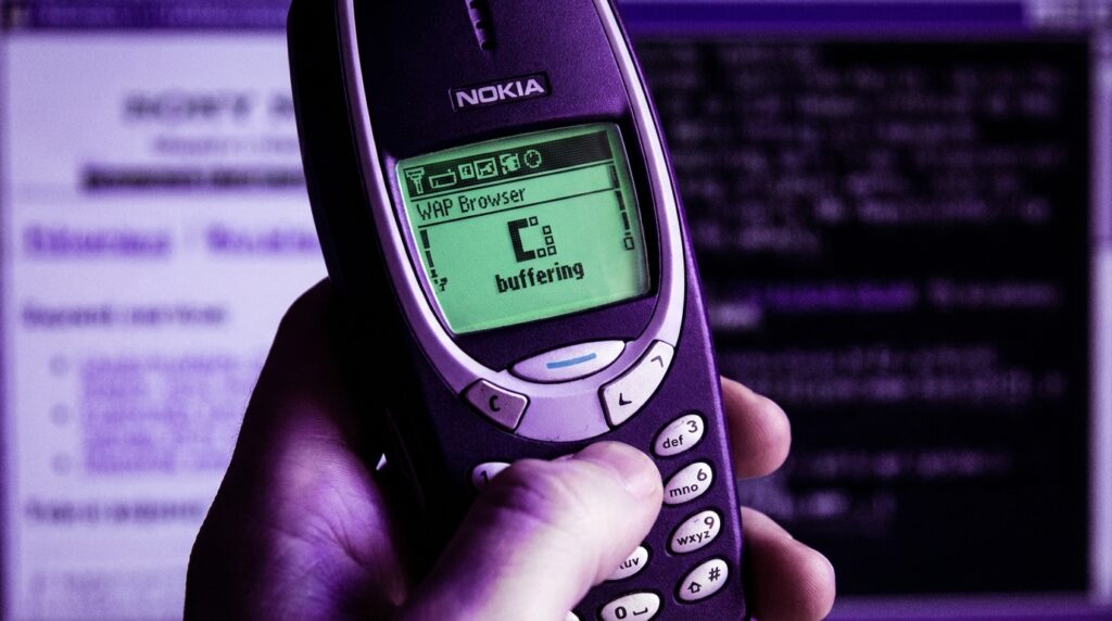
“The soft buzz of a Nokia 3330 in your pocket, the greenish glow of that tiny screen, and the slow, agonizing line at the bottom: ‘Connecting via WAP…’ You remember that sound, right?”
The funny thing about WAP is that it felt like magic and punishment at the same time. You were holding the future in your hand, but the future was loading one broken line of text every few seconds, while your prepaid credit evaporated in real time. Fast forward to now, where you just tap an icon and a full web app loads with images, video, and push notifications. No one thinks twice about it. But buried under every smooth mobile browser today is the memory of WAP browsers doing their awkward best to pretend to be the web.
When you open Chrome or Safari on your phone and a page snaps into place in under a second, you are living in the world WAP engineers were betting on, but with better tools, better networks, and fewer compromises. Back then, the mobile “web” was not the web you knew from your PC. It was a diet version, stripped of images, fonts, layout, and comfort. Yet without that friction, we probably would not care as much about responsive design, mobile-first sites, or PWAs. The pain of WAP browsers taught an early lesson: if you make people suffer for content, they will either really want it or they will walk away.
The clunky portal to the “mobile web”
The first thing you notice when you hold an old WAP phone again is the hardware. The weight is different. A Nokia 3310 or Siemens C45 has this solid brick feel, about 130 grams of plastic and battery with a small monochrome LCD. You could practically throw it at a wall and then keep browsing on WAP. The keypad has that distinct T9 click: each press a little mechanical thud, each number key pulling triple duty as letters.
Now picture that screen. Maybe 84 x 48 pixels on something like a Nokia 3310, or 96 x 65 pixels on a Siemens device. Not 96 by 65 characters. Pixels. At that resolution, an icon is basically a suggestion, and a “link” is just underlined text in a different shade of grey or green.
When manufacturers said the phone had a WAP browser, it sounded powerful. “Internet in your pocket.” What they did not highlight was the process: launch the browser, pick your access point, hit connect, wait while the GPRS or even CSD link came up, hear the faint interference in nearby speakers, and then hope nothing timed out.
Retro Specs: “WAP 1.1 browser, monochrome display, 3-line text layout, supports WML cards, up to 1.2 kbps over CSD or about 30-40 kbps on GPRS, if the stars align.”
It felt like you were peering at the web through a pinhole.
What WAP actually was under the hood
Why the “web” on WAP was not really the web
WAP stood for Wireless Application Protocol. It was not just a browser type, it was a whole stack: transport, session, and an application layer sitting on top of narrow, unreliable mobile networks.
On your PC, you had HTTP over TCP/IP, fetching HTML, images, CSS, and eventually JavaScript. On your WAP phone, you had:
– A WAP gateway run by the carrier.
– A compressed, binary version of markup.
– A markup language called WML (Wireless Markup Language) instead of HTML.
– Often a custom, stripped-down specification of what the phone could parse.
So when someone said “go to that WAP site,” they meant open a tiny WML app, delivered through a carrier gateway and rendered by a browser that barely had memory for a big menu, let alone a full web page.
WML was built around “cards” and “decks.” Think of a deck as a tiny site and each card as a screen in that site. No long scrolling pages. Just simple chunks: a small menu here, a form there, a snippet of text.
Retro Specs: “WML deck size recommended under 1.4 KB. Maximum of a few cards to avoid ‘Memory full’ errors on early phones.”
Maybe it was just nostalgia talking, but there was something oddly clean about the constraints. No pop-ups, no autoplay video. The tradeoff was harsh, though: text heavy, almost no images, and a very rigid structure.
The WAP gateway as gatekeeper
Your phone did not speak normal HTTP straight to websites in many cases. Instead, it spoke WAP to a gateway owned by your network operator. That gateway translated requests to normal web traffic and converted responses from HTML to WML, or fetched WML from origin servers.
So the path looked like this:
Phone → WAP stack → carrier gateway → web server → back to gateway → compressed WML back to phone.
This had a few problems:
– Latency stacked up, since every request hit the gateway.
– Carriers controlled what was discoverable, pushing you to their official portals.
– Billing could be tightly coupled to what passed through the gateway, which often meant expensive per-kilobyte pricing.
The result was something that felt like the web but tasted like a curated catalog.
The pain of WAP browsing in real life
Every click was a decision
Using a WAP browser was not casual. You did not open it absentmindedly while standing in line to check three different sites and a social feed. You thought: do I really want to pay for this, and do I have the patience for the loading time?
You navigated with the directional pad or the up/down keys, moving through link after link. If a site had more than five or six options on a card, it already felt crowded. Each link click triggered:
1. The “Connecting…” status at the top of the screen.
2. A noticeable pause while your phone chatted with the base station.
3. A slow progression of a simple loading indicator.
On circuit-switched data, where your phone basically dialed into the network like a modem, you paid by the minute. So that 20-second lag was not just annoying, it was measurable money on your bill.
GPRS was marketed as “always on” and packet-based, priced by kilobyte. That solved some stress but created another: you started worrying about the invisible size of each page. Images, even tiny ones, felt like luxury.
User Review from 2005: “I only check football scores on WAP. One page, refresh once. Anything more and my prepaid card is gone.”
Text, text, and a little more text
Content creators targeting WAP had to re-think everything. No CSS. Barely any layout. Tables were awkward. Fonts were fixed. Color, when present, was limited to a few tones on early color screens.
Most WAP pages were:
– Service menus: ringtones, wallpapers, operator services.
– Text portals: news headlines, weather, sports scores.
– Bare login forms for email or basic messaging.
Something like: “News > Top Stories > 1. Politics 2. Business 3. Tech 4. Sports” and each number a card.
Even entering a URL was painful. Imagine typing “http://wap.something.com” using T9, key by key, on a numeric keypad. Half the time, you would just rely on bookmarks or the carrier’s portal menus, because manually entering addresses was like doing finger gymnastics.
Timeouts and “Forbidden” errors
Because the gateway translated between worlds, errors often appeared in strange ways. You might get:
– “Service not available.”
– “Deck too big.”
– “Gateway error.”
– Or just a blank card with nothing on it.
Many early sites did not bother to support WML. If the gateway tried to convert full HTML automatically, the result could be unreadable, broken links, or truncated pages.
From the user’s point of view, you tapped on something that said “Internet” in the phone menu and then were told, in tiny blocky text, that you were not allowed to see half of it.
WAP services that people actually used
Operator portals and walled gardens
For many people, the WAP browser was basically the operator’s portal. When you hit “Services” and then “Internet” or “Web” on your phone, you were taken to a curated front page maintained by your carrier.
It usually had:
– News headlines pulled from a partner.
– Weather for a few major cities.
– A directory of paid downloads: ringtones, wallpapers, simple Java games.
– A link to your balance or account settings.
Navigation was often numbered, so you could press “1” for news, “2” for sports, “3” for “Fun & Downloads.” That made the WAP browser feel less like a browser and more like a weird, tiny app store.
A lot of the business logic lived here. Operators took a cut from downloads, from subscriptions to sports or horoscopes, from premium SMS associated with the content. The WAP browser was a vending machine with a number pad.
User Review from 2005: “The WAP page is OK for scores, but the ringtones are too expensive. 2 euros for a 10-second polyphonic tune?”
Email on WAP: possible, but barely
Some phones bundled WAP-based email clients or webmail access. Technically, you could log in, check your inbox, read a text-only message, and even send replies. In practice:
– Long messages would wrap in ugly ways across the screen.
– Attachments were often invisible or flat-out blocked.
– Typing replies with T9, character by character, was slow and tiring.
So email through WAP ended up reserved for quick checks: “Did that one important message arrive?” rather than actual correspondence.
Early mobile content businesses built on WAP
Even with all this friction, entire businesses leaned on WAP browsers:
– News brands offering mobile headlines and subscription alerts.
– Betting companies delivering live odds and results.
– Adult content portals, which often pushed the technical limits and the carrier rules.
– Early social communities with stripped-down mobile front-ends.
WAP was the first time many services thought about a second channel apart from the PC browser. That forced questions like:
– What is the minimum version of our content someone would still care about?
– How small can we shrink a page and still have it be useful?
– Which actions make sense on a keypad and a 2-line screen?
All of that thinking quietly prepared the ground for the smartphone era, where those same questions came back, this time with more capable hardware and full TCP/IP stacks.
Then vs now: from WAP to full mobile browsers
Comparing devices: Nokia 3310 vs iPhone 17
To really feel the gap, look at a classic WAP phone next to a modern flagship. The specs almost read like a joke.
| Feature | Nokia 3310 (2000, WAP era) | iPhone 17 (modern smartphone) |
|---|---|---|
| Screen size | 1.5 inch monochrome, about 84 x 48 pixels | 6+ inch OLED, around 2796 x 1290 pixels or higher |
| Browser type | WAP 1.x browser, WML support only | Full HTML5 browser with CSS, JS, WebAssembly |
| Network | GSM with CSD data, early GPRS in later revisions | 5G/6G with multi-hundred Mbps throughput |
| Input | T9 numeric keypad, directional toggle | Multi-touch screen, on-screen keyboard, voice input |
| Rendering power | Limited to text, tiny monochrome icons | Complex layouts, animations, full media playback |
| Typical page size | Under 2 KB recommended | Often > 2 MB including scripts, images, video |
| Billing model | Per minute (CSD) or per kilobyte (GPRS) | Usually monthly data bundles or unlimited plans |
Holding the old phone in your hand, the plastic shell feels simple, slightly rough at the edges, almost toy-like. The modern device, with smooth glass and metal, feels like a single slab. Yet both try to answer the same question: how do you browse information on the go?
From WML cards to responsive web apps
The shift from WML to HTML-on-mobile did not happen overnight. There was a messy middle period:
– WAP 2.0 brought in XHTML Mobile Profile, closer to HTML.
– Some phones started offering “mini browsers” that could handle basic HTML.
– Developers tried to maintain parallel sites: one for PC, one for “mobile.”
During that time, the mental model slowly changed:
– Cards turned into full pages with limited width.
– CSS started to matter, even in small ways, to adjust layout for small screens.
– JavaScript crept in for simple UI actions, then more complex behavior.
Modern responsive design, media queries, and progressive enhancement all learned from this. Without the pain of building WAP-only sites and then XHTML mobile sites, there might have been less urgency to design flexibly from the start.
Today, when a single codebase adapts gracefully from desktop to phone to tablet, it is solving the same basic puzzle that WAP designers faced: how much can you show, and how will someone navigate it with the device in their hand?
Why WAP felt so slow, even when it was working
The network bottleneck
Early mobile networks were not happy places for browsing. GSM data connections had low bandwidth and high latency, and:
– Calls usually had priority over data.
– Moving between cells could drop the session.
– Signal strength inside buildings was inconsistent.
Even with GPRS, speeds often sat in the 30-40 kbps range in real-world use. You had about the speed of an old dial-up modem, shared between signal issues and gateway overhead.
On top of that, the request/response pattern was chatty:
1. The phone asked the gateway to fetch a deck.
2. The gateway contacted the origin server.
3. The response was parsed, converted, compressed.
4. Only then did the deck trickle back over the air.
Any delay on any of those steps translated to a painfully long “Loading…” indicator on your screen.
Device memory and processing power
These phones were not built with large memory pools. A WAP browser might have had:
– Just enough RAM to keep a couple of cards in memory.
– No real caching or only extremely primitive caching.
– Minimal history, sometimes just the last page or two.
If a deck was larger than the recommended size, you would see weird behavior:
– The phone would drop older cards from memory.
– It might refuse to load and throw errors.
– Sometimes it would just freeze for a moment while it tried to juggle limited memory.
Even text layout was work. Taking a stream of WML, splitting it into lines that fit on a small screen, mapping soft-key labels to actions. All done on hardware that feels like a pocket calculator compared to modern CPUs.
This resource squeeze is part of why native apps on later feature phones became so attractive. A J2ME app could feel snappier because it did not have the same protocol overhead and parsing costs on each screen.
The user experience quirks that drove people crazy
Soft keys doing different things on every page
One huge annoyance: the two soft keys under the screen were context sensitive. On one WAP card, the left soft key might be “Select” and the right one “Back.” On another card, “Options” and “Exit.” If a site developer used a custom UI, actions moved around.
On a PC, you have a consistent browser chrome: back, forward, address bar. On WAP, even the idea of “back” was not constant. Some browsers mapped the physical “C” or “Clear” key to navigation, others did not.
You ended up reading each screen carefully before pressing anything, because one wrong press could kick you out to the home screen and close your data session, which meant reconnecting and paying more.
Bookmarks and history that barely counted
Bookmarks existed, but usually in tiny lists. Something like 10 or 20 entries, maybe less. History could be even shorter. The device just did not have the storage.
So:
– If you discovered a useful site, you had to decide if it deserved a precious bookmark slot.
– If the carrier changed the gateway or your access point config, sometimes bookmarks broke silently.
– Browsing casually and then “going back later” was rarely an option, because remembering a URL was not fun.
Compare that with having hundreds of tabs open on a modern browser without thinking about it. WAP wanted you to stay focused, but not because of good UX. It was all constraint.
Content that felt like an upsell funnel
Many WAP portals pushed you toward premium content. Ringtones, logos, wallpapers, adult services, chat subscriptions. The layout often placed free information on top, then a wall of paid options.
The flow could look like:
1. Open portal.
2. See “News, Weather, Fun!”.
3. Tap “Fun!” and land in a grid of paid download categories.
4. Each click showing a price in credits or per item.
You could feel the business model in every card. The browser was not just a reader, it was the checkout window.
WAP’s quiet influence on modern mobile design
Small-screen thinking
WAP forced designers to confront questions that later became mainstream:
– What is the core job a user wants to achieve on a phone?
– How do you make that job reachable in one or two short steps?
– What do you cut when you only have a tiny canvas?
Sports scores are a good example. On PC, you might see:
– Live scores.
– Player stats.
– Standings.
– News stories.
– Video highlights.
On WAP, you got:
– League name.
– A list of matches with scores.
– Maybe a link to a short text summary if you were lucky.
This ruthless trimming showed that people valued immediacy more than richness when they were on the move. That idea shows up today in everything from notification previews to glanceable widgets.
From portals to app stores
The operator portal was a predecessor to app stores, in a rough, pre-smartphone way. It offered:
– Curated entries, not the whole web.
– Paid downloads tied to your account.
– A browseable catalog of small experiences.
The difference now is that:
– Platforms like iOS and Android give direct access to the real web.
– App stores sit beside the browser, not instead of it.
– Payments are handled through clearer systems, not hidden inside kilobyte billing.
Still, when you scroll through categories in an app store, there is a faint echo of that “Fun & Downloads” menu on a WAP portal.
Real memories: what people actually did with WAP
Ringtones and wallpapers
Ask someone who used WAP heavily what they remember, and you will often hear one thing: ringtones.
Monophonic at first, then polyphonic, then “true tones.” WAP gave you quick access to catalog after catalog:
– Charts of popular songs turned into beeps.
– Brand tie-in tones from movies or games.
– Tiny images as wallpapers or operator logos.
You scrolled through text lists like:
“1. Crazyfrog.mid
2. Club_anthem.poly
3. Matrix_theme.poly”
Each download triggered SMS confirmations, billing entries, and often stored the content in a cramped gallery on the device.
User Review from 2005: “Spent half my credit on a ringtone that sounds nothing like the original. Still keeping it.”
It was clunky, but it was one of the first personalizations you could do that came from the network, not from a cable and PC.
Checking scores and headlines on the move
The other big category was information. WAP portals delivered:
– Live match updates: scores, scorers, minute of the game.
– Basic stock prices.
– Breaking news headlines, with text snippets.
You might be out with friends, feel your phone buzz, and quickly open a WAP page to see the latest score. The text would appear, maybe delayed, but it was enough to keep you in the loop without being at home in front of a TV or PC.
That sense of being connected is what we take for granted now with push notifications and full apps. In the WAP era, even half-broken live data felt powerful.
Why developers tolerated WAP
Squeezing experiences into kilobytes
Building for WAP was not glamorous. You handled:
– WML’s weird deck and card model.
– Strict size limits.
– Limited character sets and encoding quirks.
– Gateway behavior that varied by operator and country.
Yet there were reasons people stuck with it:
– It opened up access to users who did not own PCs.
– It offered billing paths through carriers, which meant revenue.
– It pushed skills in keeping resources small and focused.
Many developers in that time learned hard lessons about:
– Reducing request counts.
– Minimizing payloads.
– Handling flaky connections.
Those same skills matter even more now when building for markets where high-speed data is not universal, or where users run out of battery and bandwidth faster than you expect.
The step between SMS and full mobile apps
Before WAP, interactive services often lived in SMS and USSD menus. You sent a shortcode, got a reply, maybe tapped through numeric menus. It was all text over the core signaling network.
WAP extended that idea:
– Slightly richer layouts.
– Links instead of numeric replies.
– The ability to host more complex logic on servers using standard web stacks.
You can see the progression:
SMS/USSD → WAP → J2ME/Brew apps → early smartphone browsers → app stores + rich web apps.
Without WAP filling that middle step, many services might have waited longer before going mobile at all. WAP was a bridge, even if it swayed in the wind and made everyone nauseous.
The sensory memory of early mobile browsing
Plastic, glow, and lag
Think about the physical experience. You are in a dim room. The tiny green backlight of the screen feels harsh and narrow. The plastic casing is slightly warm from your hand. You press the menu key, scroll down to “Services,” tap “Select,” then “Web.”
A brief pause.
“Connecting via GPRS…”
You hear nothing, but if there is a speaker nearby, you might catch the faint buzzing interference pattern old GSM radios loved to create. Your thumb hovers, waiting. The first card arrives.
Text appears in that pixel font, each character only a handful of blocks. The soft key labels flicker: “Options” and “Exit.” You scroll down. One more line. Another. The phone redraws the screen in little jumps rather than smooth scrolling.
Maybe it was just nostalgia talking, but that loading delay created drama. Did your team score? Did the message go through? You were invested because every second carried cost and attention.
The soft-click ritual of T9
Typing anything into the WAP browser felt like a ritual. T9 tried to help, guessing words as you hammered numbers. But URLs, usernames, and passwords were often outside its dictionary.
So:
– You pressed “7” four times to get “s.”
– You waited between presses so the phone knew you were moving to the next letter.
– Your thumb started to ache after a short while.
Input constraints helped shape behavior. You did not post long comments. You did not fill long forms. You mostly read, navigated short menus, and confirmed short actions. That pattern still influences how modern services think about “quick actions” vs deeper engagement.
The slow fade of WAP browsers
WAP did not disappear in a single moment. It faded out as:
– 2.5G and 3G networks improved speed and reliability.
– Phones began shipping with more capable browsers that spoke standard HTTP.
– Better displays made rich content practical.
– Platforms like Symbian, Windows Mobile, then iOS and Android pulled focus toward full apps and full browsers.
For a while, hybrid phones shipped with both a WAP browser and an HTML browser. Portals slowly started serving XHTML or light HTML instead of pure WML. Some carriers kept WAP portals alive in parallel for low-end devices, especially in regions where smartphones arrived later.
Today, if you dust off an old phone and open the WAP browser, many of those original portals are gone. Gateways have been shut down. DNS records point nowhere. The browser tries to connect and then sits, waiting forever, as if the early mobile web has been erased.
Retro Specs: “Browser error: Service not available. Try again later.”
Behind your modern mobile browser, behind every responsive layout and instant-loading page, there is that ghost: a tiny monochrome screen, a handful of pixels, T9 clicks, and a WAP gateway somewhere in a data center translating your ambition into something that could squeeze through a fragile mobile signal.
