
“The faint tap of a plastic stylus on a resistive touchscreen, a soft vibration, and that tiny Start menu popping up in the top left corner.”
The funny thing is, when you hear people talk about phones now, they talk about 120 Hz displays, periscope cameras, AI features baked into everything. Back then, we were just happy if our Windows Mobile 6.5 device woke up from standby without hanging on the lock screen. But that little Start button in the corner and the stylus in your hand were the closest thing to carrying a tiny PC in your pocket. Today you swipe up on an app drawer. Back then you tapped the Windows logo like you were booting up a mini laptop on a 3.2 inch panel.
You remember that sound, right? That soft “click” of the plastic stylus on a screen that was more flexible sheet than glass. You did not brush the screen. You pressed it. Hard enough to move the top layer and trigger the sensors underneath. And when you did, Windows Mobile 6.5 tried its best to pretend it could be finger friendly, while still clinging to menus designed for a mouse pointer.
The story of Windows Mobile 6.5 sits right at that awkward point in mobile history where we wanted our phones to act like PCs but we were starting to see how limited that mindset really was. You had the Office icon right there. Word Mobile, Excel Mobile, PowerPoint Mobile. Real files. Real folders. A Start menu. A Today screen. And you poked at them all with a stylus that weighed almost nothing and still somehow felt like a serious tool.
This was an operating system that already felt old when it arrived. Apple had already showed off the iPhone. Android was getting traction. Capacitive screens were letting people pinch and swipe without pressing the glass in. Yet Windows Mobile 6.5 tried one more time to make the stylus era work in a touch-first world. Maybe it was just nostalgia talking, but for a certain kind of user, carrying a Windows Mobile 6.5 device felt like carrying a tiny workstation that fit in the front pocket of your jeans.
The feel of the stylus era
Pick up something like an HTC Touch Pro2 or a Toshiba TG01 in your mind for a second. The weight was noticeable. Often somewhere between 160 and 200 grams, packed with a slide-out QWERTY keyboard or a thick battery that saw real email battles during the workday. The plastics had a slight give when you pressed the back cover. The chrome accents picked up scratches from keys and coins. The front face was usually a glossy frame around a surprisingly small display by modern standards.
Windows Mobile 6.5 lived inside screens that hovered in that 2.8 to 4.1 inch range. Resolution numbers like 240 x 320 (QVGA), 480 x 640 (VGA), and for the brave, 480 x 800 (WVGA). The pixels were large enough that you could sometimes see the grid if you looked closely. Text was crisp enough for spreadsheets, but icons looked more like tiny stickers than today’s vector art.
And then there was that stylus. Usually tucked in a slot on the side or bottom. Some extended with a little metal shaft that slid out with a satisfying resistance. Others were full plastic, short, almost toy-like, light enough that losing one happened more often than people wanted to admit. The tip created a muted thud when it hit the resistive panel. Not a tap on glass. More like pushing a thin piece of plastic wrap down onto a sensor.
Windows Mobile 6.5 still carried the legacy of Pocket PC and early smartphone editions. The interface had checkboxes, tiny menus, drop-downs. The kind of UI that made a stylus feel necessary rather than optional. Microsoft tried to polish it with honeycomb-style menus and bigger on-screen elements, but the DNA came from a world of styluses and small, precise taps.
“User review from 2009: ‘Finger works for calls and basic stuff, but for Excel I still pull out the stylus. It just feels more accurate, like I’m really working on something.'”
That feeling of “really working on something” is what made the platform attractive for a specific type of user. Not everyone wanted to pinch and zoom through photos. Many wanted to edit a PowerPoint on the train, reply to long emails in Outlook Mobile, and sync tasks in real time with Exchange. The stylus made that practical on a resistive display, at least if you had patience.
Windows Mobile 6.5: the almost modern OS
The last big patch before Windows Phone
Windows Mobile 6.5 showed up in 2009 as more of a stepping stone than a fresh start. Internally, it was still the Windows CE 5.x base that powered earlier versions. Microsoft knew they were working on a very different reboot that later became Windows Phone 7, but they still had hardware partners and enterprise clients relying on the old line.
So 6.5 became a sort of “we heard you” update. Bigger touch targets. A more finger friendly Today screen. A lock screen that tried to feel more like a phone and less like a mini desktop. The honeycomb Start menu arranged icons in a staggered grid meant to help your thumb land on the right app. It was clever in theory. In practice, many people still reached for the stylus when things got serious.
Under the hood, you still had that classic Windows folder structure. Windows, Program Files, My Documents. You could browse the filesystem with File Explorer. Copy CAB files onto your device, tap them, and install applications that felt like old school Win32’s tiny cousins.
“Retro Specs: HTC Touch Pro2 (Windows Mobile 6.5)
– CPU: Qualcomm MSM7200A, around 528 MHz
– RAM: 288 MB
– Storage: 512 MB ROM, microSD up to 16 or 32 GB
– Display: 3.6 inch, 480 x 800, resistive touchscreen
– Input: Slide-out QWERTY keyboard, stylus, resistive touch”
That CPU mark, around the 500 MHz range, sounds almost funny if you stare at a modern flagship spec sheet. But paired with Windows Mobile 6.5’s lightweight interface and text heavy applications, it handled email, calendars, and Word docs surprisingly well. Where it struggled was with the emerging world of rich web browsing and media.
The Start menu and Today screen
The heart of the experience sat between two spaces: the Today screen and the Start menu.
The Today screen was your “home page”. In early versions, it looked cramped, with small text and plug-ins stacked vertically. 6.5 tried to give it some breathing room. Bigger fonts. On some devices, layered shells like HTC Sense sat on top and transformed that space into a customizable dashboard with weather, flip clocks, quick settings, and contact shortcuts. Beneath the skin, though, it was still the Today plug-in model.
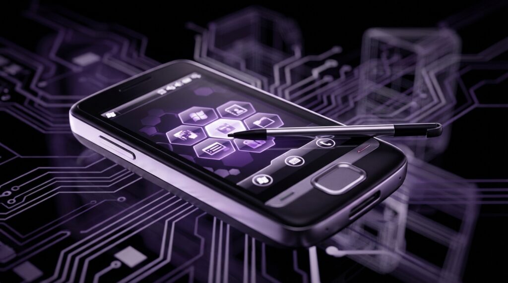
Tap the Start logo at the top left and you hit that honeycomb grid. Each icon sat on a small tilted hexagon. It looked more playful than old menus, and you could scroll through pages with a flick like on a modern device, though sometimes the scroll stuttered if the device was busy in the background syncing email.
These design tweaks were clearly aimed at trying to make a stylus-centric OS feel more comfortable with finger use. Bigger icons, more space between items, less need to aim at 1 or 2 pixel dividers. But once you opened many apps, you landed right back in small buttons, tiny close icons in the top right corner, and scroll bars that practically begged for a stylus tap.
The stylus as a tool, not an accessory
Precision on a plastic canvas
Resistive touch panels used in Windows Mobile devices detected pressure, not the electrical properties of your finger. Light taps sometimes did nothing. A firm press, with a fingernail or the stylus, triggered the input. That created a different rhythm from modern phones.
You pressed to select. You pressed and held to bring up context menus. You guided the stylus along scroll bars instead of flicking lists. It felt closer to using a tiny pen on a notepad than tapping glass.
And that sense of precision mattered for several use cases:
– Selecting small spreadsheet cells in Excel Mobile without hitting the wrong one.
– Marking sections of text for copy/paste in Word Mobile.
– Navigating remote desktop sessions where the phone screen mirrored a full Windows desktop.
– Drawing quick diagrams or signatures in note apps.
For handwriting note takers, stylus and resistive screens offered a certain satisfaction. The drag of the tip across the panel had tiny friction. Lines followed with only slight input lag. Not as smooth as later stylus tech on modern tablets, but functional enough to scribble shopping lists or phone numbers during calls.
“User review from 2005 (Windows Mobile predecessor, but same stylus feel): ‘Graffiti on Palm was fast, but I like actually writing letters on this screen. It feels more like a real notebook, just with alarms and contacts built in.'”
Windows Mobile inherited some of that energy. There were handwriting recognizers and input panels that let you write characters, which the system converted to text. Accuracy depended on your writing style and patience, but when it worked, it felt like magic from the future squeezed into a plastic shell that warmed up in your hand during long calls.
Stylus vs finger: the daily fight
By the time 6.5 arrived, finger based touch interaction was visible everywhere. People watched videos of the iPhone’s kinetic scrolling, smooth zooming in Safari, and neat on-screen keyboard. Windows Mobile 6.5 tried to follow that direction without rewriting everything from scratch.
So you ended up in a mixed world:
– Finger for quick actions: answering calls, opening the dialer, scrolling through contact lists with big fonts on top of friendly overlays.
– Stylus for advanced work: forms with many fields, Excel sheets, precise web links, and legacy configuration screens buried in Settings.
On devices like the Samsung Omnia II or HTC HD2, hardware makers layered their own UIs over the top to hide some of the old menus. Large tab-based interfaces with weather, photos, browser, and messaging all accessible by thumb. Behind that, though, tapping into deeper features revealed the same old stylus-oriented screens.
That split personality is part of what makes Windows Mobile 6.5 so interesting in hindsight. It tried to span two ages at once. It would show you a thumb friendly dialer, then drop you into a control panel designed in a world where only a stylus existed.
Then vs now: Windows Mobile 6.5 vs a modern flagship
To really see how far things moved, it helps to compare what power looked like then with what you carry now. Not as a “better vs worse” argument, more like a snapshot of priorities that changed over time.
| Feature | Windows Mobile 6.5 Phone (e.g., HTC HD2, 2009) | Modern Flagship (e.g., iPhone 17) |
|---|---|---|
| Display | 4.3 inch, 480 x 800, resistive, ~217 ppi, 65K colors | ~6.3 inch, ~2796 x 1290 (approx), OLED, 120 Hz, 460+ ppi |
| Touch Input | Resistive, stylus oriented, basic multitouch on rare models | Capacitive, full multitouch, gesture first, active stylus optional |
| CPU | 1 GHz single-core (Snapdragon S1) at best | Multi-core, custom silicon, performance & efficiency clusters |
| RAM | 448 MB or less | 8 to 12 GB or more |
| Storage | 512 MB ROM + microSD (8 to 32 GB common) | Base 128 GB, up to 1 or 2 TB, no microSD |
| OS Design | Menu + desktop style, Start menu, stylus UI, file system exposed | Card/app centric, gesture UI, limited direct file system exposure |
| Office & Productivity | Mobile Office, basic editing, stylus for precision | Full cloud integrated suites, real-time collaboration, large keyboards |
| Apps | Windows Marketplace for Mobile (short lived), many CAB sideloads | Huge app stores, subscriptions, cloud sync, constant updates |
| Input Methods | Stylus, physical call keys, sometimes slide-out keyboard | Touch gestures, on-screen keyboard, sometimes optional pencil or pen |
| Connectivity | 3G, Wi-Fi b/g, Bluetooth 2.x, microUSB | 5G, Wi-Fi 6/7, Bluetooth 5.x, USB-C or proprietary port |
Looking at that table, the specs jump out, but the real shift sits in how people interact. With Windows Mobile 6.5, the assumption was: “You are going to manage files, tweak settings, and handle documents almost like you would on a PC.” Today the assumption is: “You are going to live inside apps that hide complexity, sync data online, and give you services rather than file trees.”
The stylus, in that older world, was not a luxury add-on. It was part of the default mental model. A small, accurate pointer to handle all the small, dense UI elements that came from the desktop heritage.
What Windows Mobile 6.5 tried to be
The mini-office in your pocket
On paper, Windows Mobile 6.5 checked boxes that many modern devices still chase, even if they deliver them differently.
– Deep Outlook integration with corporate Exchange servers.
– True multitasking with background apps, even if battery life sometimes paid the price.
– Direct access to file systems and removable storage.
– Support for VPNs and enterprise security tools.
– Mobile Office that opened and edited “real” documents.
You could be sitting in a meeting with a stylus in one hand and a Bluetooth stylus or headset connected, editing a Word file someone just emailed to you. Save it, attach it, reply all. It felt like scaled down laptop work, not a lighter “mobile” version.
For some users, that was the dream. Carry less hardware, still handle serious tasks away from the desk. For others, it felt too much like a shrunk desktop crammed into a small phone with menus that were not exactly friendly.
“User review from 2009: ‘This is not a toy phone. If you just want to browse and play, go iPhone. If you need to respond to Exchange emails and edit Word docs, this wins. Just wish it was a bit smoother with touch.'”
Reading that kind of review now, you can almost feel the split between work and play in mobile operating systems. Windows Mobile 6.5 leaned hard into work. Entertainment was there, but in a secondary role. Music players, basic video playback, some games that often felt like classic PDA titles with stylus taps instead of controllers.
The app story and Marketplace for Mobile
Windows Mobile always had third-party apps, but distribution looked different from modern stores. You went to websites, downloaded CAB files, copied them over via ActiveSync, and tapped to install. Some vendors shipped installer EXE files for the PC that pushed apps through to the phone when connected.
With 6.5, Microsoft launched Windows Marketplace for Mobile, an official app store. The idea mirrored what Apple and Google were building: a central place to find, buy, and update apps. It came late and never built momentum. The store’s life was short and the catalog small compared to rivals. Still, for people used to sideloading, having an on-device store felt like a small modernization.
Games ranged from simple puzzle titles written for stylus input to ports of older PC or console games. Resistive screens and underpowered GPUs made fast action less comfortable. Turn-based tactics, board games, card games, and stylus puzzle games fit better.
Hardware that carried Windows Mobile 6.5
Devices that defined the era
Certain phones stand out when you think about Windows Mobile 6.5. Not just for raw specs, but for how they looked, felt, and tried to bridge that old-new gap.
– HTC HD2: A legend among enthusiasts. Huge 4.3 inch WVGA screen for the time, slim body, capacitive touch, and later famous for running all kinds of hacked operating systems. Officially shipped with Windows Mobile 6.5, but the community turned it into a gateway device for Android and more.
– HTC Touch Pro2: The business workhorse. Slide-out QWERTY keyboard with a slight curve that made long typing sessions comfortable. Big resistive screen, solid stylus, and heavy enough to feel serious in hand.
– Samsung Omnia II and others in the Omnia line: Bright AMOLED screens before that became standard, with Samsung’s own interface layers over Windows Mobile to make touch smoother.
– Toshiba TG01: Ultra thin, large screen, one of the first with a 1 GHz Snapdragon, living proof that raw CPU speed alone could not solve software design limits.
Some of these phones had build quality that still feels decent if you find a working unit today. Metal frames, slide mechanisms that click into place with precision, removable batteries with tight tolerances. Others feel more hollow, with plastics that creak if you squeeze the sides.
What ties them together is that stylus slot and the sense that you were holding something more like a PDA upgraded into a phone rather than a phone upgraded into a smart device.
Buttons, keyboards, and call management
You did not rely only on the screen. Hardware keys were common:
– Call and end buttons.
– Start menu button on some models.
– Directional pads or trackballs.
– Dedicated Windows and back keys.
On slider devices, a full QWERTY keyboard gave physical feedback for emails and documents. Many people still preferred that over on-screen keyboards, especially on resistive displays where typing by touch alone was less pleasant.
The stylus fit in alongside these inputs as another option instead of the primary one. For calls and texting, you could often go full hardware keys. For configuration and productivity, the stylus came out like a pocket screwdriver when you needed the right tool for a precise screw.
The end of the stylus-first phone OS
Windows Mobile 6.5 did not have a long frontline career. Microsoft announced Windows Phone 7 not long after, with a cleaner, tile-based interface, strict hardware requirements, and a clear break from the stylus era. No legacy app compatibility. No tiny menus. No Today screen plug-ins. A total reset.
That shift signaled more than just a new coat of paint. It meant that the idea of a phone as a tiny Windows PC with a Start menu, explorer-like file access, and stylus navigation was fading fast. The world moved to capacitive displays, finger gestures, and app centric, sandboxed environments.
At the same time, the stylus itself did not vanish. It just moved upward in screen size and changed role.
| Aspect | Then: Windows Mobile 6.5 Stylus | Now: Modern Phone/Tablet Stylus (e.g., Apple Pencil, S Pen) |
|---|---|---|
| Primary Role | Main navigation and precision input | Optional tool for drawing, notes, and creative work |
| Screen Type | Resistive, pressure based | Capacitive with active pen digitizer |
| Accuracy | Good for tap targets, basic handwriting, some lag | High accuracy, low latency, pressure and tilt sensitive |
| OS Design | UI elements sized assuming stylus precision | UI sized for fingers first, stylus features layered in apps |
| Attachment | Slotted into phone body, often passive stick | Magnetic, charged, with buttons, sometimes sold separate |
The stylus moved from being the default way you hit microscopic checkboxes to being a creative instrument for sketches, layered drawings, and handwritten notes that sync into the cloud.
Windows Mobile 6.5 sits right at that pivot point. It is the last big breath of the original stylus phone era, where tapping plastic on plastic was not just a preference, it was the assumption baked into the operating system.
“Retro Specs: Windows Mobile 6.5 OS Highlights
– Base: Windows CE 5.x
– Interface: Start menu, Today screen, honeycomb launcher in 6.5
– Input: Stylus first, partial finger tweaks
– Multitasking: True background apps, task manager accessible
– Connectivity: Deep Exchange support, VPN, Bluetooth, 3G
– Distribution: Windows Marketplace for Mobile + sideloaded CABs”
When you look at your modern device with its edge-to-edge OLED and fast face unlock, it is easy to laugh at blocky icons and resistive screens. But that awkward, stylus heavy phase helped surface a tension that still shapes mobile software: how much “PC” do we put in the phone, and how much do we rethink from scratch for thumbs, swipes, and taps instead of cursors and styluses.
Windows Mobile 6.5 tried to be both. It wrapped a desktop legacy in finger painted wallpaper and hexagonal icons, but underneath, the old habits stayed. You can still feel that mix if you boot one up today, stylus in hand, watching the Start menu appear in the corner of a screen that bends a little when you press down.
