

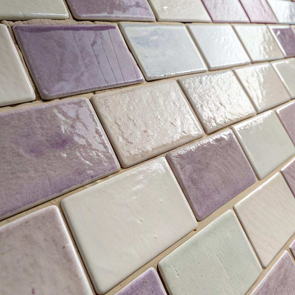
What if I told you that the most futuristic thing in your kitchen might be a wall of imperfect, hand-made tiles that look like they were pulled out of a 1960s courtyard?
The short answer is this: a soft, reflective, slightly irregular cream zellige tile backsplash gives you the warmth of old-world craft and the clarity your screens, smart lights, and gadgets need. It is calm enough for tech, nostalgic enough to feel human, and reflective enough to make small spaces feel larger without feeling cold.
That is the basic idea. Now let us pull it apart a bit.
Why cream zellige feels nostalgic and strangely tech friendly
If you look at one cream zellige tile in your hand, it seems simple. A small glazed square, uneven edges, a bit of waviness on the surface. When you put hundreds together on a wall, something strange happens. The wall looks both old and modern. Calm and busy at the same time.
That tension is why people who love retro gadgets, early web design, vinyl records, and smart homes end up drawn to it.
Cream zellige sits in that rare space where analog irregularity works with digital precision instead of fighting it.
Here is why it works so well in a tech heavy home or workspace:
- The color is neutral and low contrast, so it does not fight with screens or LED strips.
- The variation in each tile gives you small flashes of light, which feel a bit like pixels or noise.
- The imperfections keep the space from feeling like a showroom or a lab.
- It plays well with almost any metal, plastic, or glass finish.
You end up with a wall that feels like history and still photographs like a product shot.
The quiet science behind the look
This will sound odd, but a lot of the charm comes down to how light behaves.
With cream zellige, you get three things at once:
1. A light base tone that bounces daylight around the room.
2. Small surface ripples that catch and bend light at different angles.
3. Grout lines that break up glare and give your eye a rhythm.
If you work near screens, you know strong reflections can be annoying. Glossy white glass can feel harsh. Flat paint can feel dead. Cream zellige sits somewhere between those extremes.
On video calls, you do not want a mirror behind you. You also do not want a flat, dark hole. The tile gives you a soft, active background, with a bit of sparkle that makes you look more “in place” without screaming for attention.
Think of each tile as a low-resolution pixel that still carries warmth from the person who shaped it.
That blend is exactly what many people crave right now: technology present, but softened by evidence of human hands.
How screens, LEDs, and tiles talk to each other
In a kitchen or studio with:
– Under cabinet LED strips
– A wall-mounted tablet
– Smart speaker displays
– Maybe a charging station or coffee machine with lights
you already have tiny points of light everywhere.
On a flat, matte wall, those points feel isolated. On something mirrored, they become distracting. On a cream zellige wall, they scatter. You see small, broken reflections in many tiles. It almost feels like the backsplash is “listening” to the tech, but in a subtle way.
I once helped a friend with a small condo kitchen that had a dark quartz counter and a lot of smart lighting. When we tested different backsplash materials, plain subway tile looked too sharp. Stone felt heavy. When the contractor taped up a few cream zellige samples, the whole room softened. The LEDs looked kinder. The counter looked less severe. The tech did not change at all, yet the mood did.
Old craft, new context
Zellige tile is not new. It has roots in centuries of Moroccan craft, where tile makers shape and glaze small clay tiles by hand. Many people who love it are drawn to that history, but there is more to the story when you look at it from a tech point of view.
You have a manual production method meeting a very modern use case: people want a background for content, calls, and photos that feels:
– Real
– Timeless
– Not obviously tied to one trend cycle
There is an irony here. We live surrounded by machine perfection, and then we pay for intentional flaws. Chips. Irregular edges. Shade variation. All the things factories tried to remove in the 20th century.
The nostalgia in cream zellige is not just about the look; it is about seeing the mark of a slower process in a very fast world.
Why cream, not white or gray?
You might wonder why people go for cream instead of crisp white or cool gray, especially if they like tech.
A simple breakdown helps:
| Color choice | Visual effect with tech | Emotional tone |
|---|---|---|
| Bright white glazed tile | High glare, strong reflections, can compete with screens | Clean, but can feel sterile or cold |
| Cool gray flat tile | Low reflection, can absorb light, makes LEDs feel harsher | Calm, sometimes a bit flat or serious |
| Cream zellige tile | Soft reflection, gentle light scatter, works nicely with LEDs | Warm, relaxed, slightly nostalgic |
When you set a black phone, a stainless coffee machine, or a smart speaker in front of cream tiles, the contrast looks deliberate but not sharp. You get that “photo-ready” look that you see in a lot of product shots, but with more texture.
Balancing analog and digital in your space
So how do you actually use a cream zellige backsplash in a real home where you cook, work, and zone out in front of your laptop?
I think it helps to plan around three simple questions.
1. Where does your attention actually go?
Most people overdesign the parts of the kitchen that do not get looked at very often, and underthink the places eyes actually land.
Ask yourself:
– Where do you stand when you make coffee or tea?
– Where do you join video calls if you work at the kitchen island?
– What does your eye see first when you walk through the door?
If your main work or “tech” zone is under a cabinet, a cream zellige wall behind it can become your everyday background. Not just for others on a call, but for you while you wait for a progress bar to finish.
You want something you can look at every day without getting tired. The small variations in tile tone and surface give your brain just enough detail to rest on, without feeling busy.
2. How much contrast do you really want?
Pure black appliances on cream tile look sharp. That can be good, but it is stronger than some people expect. Soft white or stainless blends more.
Here is a simple comparison to think about:
| Combo | Effect next to cream zellige | Who it suits |
|---|---|---|
| Black hardware & appliances | Strong, graphic contrast, tiled wall becomes a light “screen” behind dark shapes | People who like a slightly techy, modern feel |
| Brushed steel & chrome | Reflective meets reflective, soft glints and highlights | People who like a balanced, clean look |
| Warm brass or bronze | Very nostalgic, jewelry-like spark against cream | People who want more of a retro or classic vibe |
If your home already has a lot of screens, gamers gear, or RGB lighting, you might lean toward softer metal finishes so the space does not feel like a control room.
3. How will it age with your tech?
Your phone, router, and smart fridge will change in a few years. Your tile probably will not. That mismatch in timelines can be a good thing if you pick a backdrop with enough neutrality.
Cream zellige tends to sit outside of specific tech trends. It worked ten years ago in more traditional homes. It works now next to flat black appliances. That gives you more freedom to swap out devices without feeling like your space belongs to a certain year.
If you ever kept an old computer on a wood desk, you know how the furniture outlived the machine. You want your backsplash to be that desk. Stable. Calm. Able to host whatever new gadget shows up next.
Using cream zellige in different tech heavy rooms
Most people think of backsplashes in kitchens only. In a world of laptops and tablets, walls travel with us a bit more. That sounds abstract, but you know what I mean. Your background moves to wherever you sit with the camera.
Here is how cream zellige can work in different spaces where tech lives.
Kitchen: the classic backdrop for calls and content
This is the main target for a cream zellige backsplash, and probably the most obvious.
It helps to think about zones:
- Cooking zone: behind the range or cooktop.
- Prep / work zone: under a run of cabinets where you might also dock a laptop or tablet.
- Coffee / appliance zone: where the machines line up.
If your budget is tight, putting zellige only behind the range and coffee zone can still give you plenty of visual impact. When you take a photo of a dish, or when someone sees into the kitchen on a call, those are the parts that show up most.
If you habitually sit at the island with a laptop and your camera faces the cabinets, your tile choice ends up in many video calls. Cream zellige reads as neutral and soft behind you, but the variation keeps it from looking like a fake background.
Workspace or studio: blending cameras, mics, and craft
In a small content studio or desk corner, a section of tiled wall can act as a physical “set” for:
– Unboxing videos
– Product shots
– Streaming
– Photography experiments
You could tile only a vertical slice behind a standing desk, almost like a digital background but permanent. With controlled lighting, you get interesting reflections without weird color shifts. Cream tends to play nicely with camera sensors and white balance, unlike some more saturated shades.
If you are into analog gear too, like film cameras or cassette players, the tile adds one more layer of tactile texture that echoes that love of older objects.
Bathroom: mirrors, screens, and reflection control
Many bathrooms now include:
– Smart mirrors
– Bluetooth speakers
– Charging shelves for toothbrushes and razors
All of that brings tech into a space that also deals with steam and water.
A cream zellige wall behind or next to the mirror can:
– Soften the light that bounces into the mirror
– Give the space warmth so the tech does not feel clinical
– Create a nice backdrop for those (admit it) mirror selfies with your phone
You do need to treat the grout and keep it clean, because soap and minerals will build up over time. That is true for any tile, though, not just zellige.
Mixing nostalgia shades with a modern palette
If cream is the calm base, you might wonder what other tile colors or surfaces can live in the same home without turning it into a patchwork.
You mentioned colors like black, beige, brown, and even pink. They all can work, but with some care.
Layering color softly
Think of the space in terms of role:
| Color family | Role in a tech heavy interior | How it relates to cream |
|---|---|---|
| Cream / beige | Background, base tone, large areas | Supports almost everything without shouting |
| Warm gray | Bridges cool metals and warm woods | Helps your tech feel integrated, not floating |
| Brown / terracotta | Accents, floors, or focus walls | Adds depth and a sense of grounded history |
| Black | Edges, frames, small surfaces | Outlines the space, frames the cream tiles |
| Soft pink | Small blocks, maybe a niche or shelf back | Gives a human, almost skin-like warmth next to cream |
If you fill every wall with intense color, your screens and devices start to fight for attention. Let cream carry most of the vertical area, then bring in stronger shades in contained places.
For instance:
– A cream zellige backsplash in the kitchen
– A slightly deeper warm gray tile in the bathroom
– Terracotta floor tiles in a small entry or mudroom
– Black metal frames around shelves or lighting
You keep the nostalgic thread through color temperature and texture, while your tech remains the most “precise” looking element.
Choosing grout, layout, and size with tech in mind
Most tile conversations get stuck at color and forget about details like grout. Yet those small choices change how the space feels on camera, and how your eyes rest during a long day at the laptop.
Grout color: sharp grid or soft field?
With cream zellige, you have two main paths:
- Light grout close to the tile color
This creates a soft, almost plaster-like field when you squint. The grid is gentle. Great for minimal spaces or where there are already many hard lines from cabinets, screens, and counters. - Slightly darker grout
This brings out the individual tiles and gives a more graphic pattern. On camera, it reads like a pixel grid behind you. More energy, more visual noise.
If your kitchen already has strong lines from handle profiles, shelf brackets, and big appliances, going with lighter grout can prevent visual overload.
Tile size and pattern
Zellige often comes in small squares like 4 x 4 inches or similar. That smaller size creates more joints, which can be charming, but it changes how busy the wall feels.
Some rough guidance:
| Tile size | Perceived effect | Good for |
|---|---|---|
| Small square (around 4 x 4) | More texture, more “pixel” feeling, strong craft vibe | Backgrounds you want to feel animated but still neutral |
| Rectangular / subway-like | More linear, more modern, fewer grout lines | Spaces with a lot of visual noise already from tech |
If you plan to record a lot of video with shallow depth of field, smaller tiles create a nice blurred pattern that reads warmly behind you. Larger rectangles can look more streamlined.
What about maintenance in a real, messy, gadget-filled life?
There is a small misconception that anything “old world” or handcrafted is hard to live with. Sometimes that is true. With zellige, you just need to understand what you are getting.
Here are some points without sugarcoating:
- The surface is glazed, so splashes wipe off pretty cleanly.
- The uneven surface can catch dust in tiny dips, so shelves and low ledges may need an extra wipe.
- Grout needs care near cooktops, just like any other tile, especially if you cook with a lot of oil.
- Small chips in edges do not ruin the look; they blend into the handmade vibe.
If you are the type who wants everything flawless, zellige might bother you a bit at first. There will be tiles that look “off” or a bit crooked. Over time, that usually becomes the charm, but it can surprise perfectionists.
For people who grew up with scratched consoles, scuffed controllers, and slightly yellowed keyboards, that mild wear can actually feel comforting. It fits into a life where objects show use.
How nostalgia and tech taste shape each other at home
There is an interesting feedback loop here that goes beyond tile.
People who care about design, tech, and history often:
– Run older software in emulators
– Buy new devices with retro cues
– Listen to digital music but keep a record player for the ritual
A cream zellige backsplash fits nicely into that mindset. It does not scream “smart home” like a wall of colored LEDs. It speaks of another era, but it looks good when you set a tablet in front of it.
You may also notice how many tech brands shoot their products in sets that feel warm and somewhat nostalgic: wood desks, fabric textures, matte walls, gentle light. A tiled wall of cream squares behaves like that kind of backdrop in real life, not just in promo photos.
I have seen people set their keyboards or gadgets on the counter and angle them so that a slice of the backsplash is visible in the frame. That is not an accident. The tile lends them some history, some tactility, so the objects feel less temporary.
Common questions about cream zellige and tech heavy spaces
Q: Will the reflective surface cause glare on my screens or in photos?
A: In most cases, no, or not in a bad way. The surface is irregular, so it scatters light instead of bouncing it in one clean direction. You might catch small glints, especially from direct spotlights, but they usually show up as soft highlights rather than sharp streaks. If you are very sensitive to reflections, aim your strongest lights slightly away from the wall or use diffusers.
Q: Does cream zellige look dated quickly?
A: It tends not to, mainly because it does not sit in a narrow trend band. The tiles have looked similar for decades and probably will for decades more. What changes around them are cabinet styles, counters, and appliances. As long as you keep the color quiet and natural, the wall feels more like a background than a trend statement.
Q: Is it worth paying more for handmade tiles when I already spend so much on tech?
A: That is the one place where I will push back a bit. If your budget is tight, I do not think anyone should strain finances for tile just to match some look on social media. A flat, simple ceramic tile in a calm cream tone can still give you a nice backdrop. Handmade zellige adds depth and texture that you can feel, but it is not a moral upgrade. It is just a choice about how much irregularity and craft you want in your line of sight every day.
