
“The soft buzz of a Nokia 6600 spinning its menu icons, that tiny joystick under your thumb, the laggy flip from ‘Messages’ to ‘Profiles’… and somehow it felt fast enough to run your whole life.”
You remember that rhythm, right? The way menus stacked in neat little lists, no widgets, no infinite feeds, just icons and options. Back then, the “launcher” was invisible. It was just how the phone worked. Now your Android phone wakes up with four news carousels, a dozen suggestion rows, and a search bar that insists you should watch another video instead of answering that email. This is where Android launchers in 2025 come in: they give you back that feeling of a tool, not a slot machine. Same pocket computer, different skin, different rules.
Minimalist launchers are not about being pretty. They are about control. Fewer icons, fewer taps, less mental noise. They shape how you move through your phone, how often you get sucked into social apps, how quickly you reach what matters. The jump from a stock launcher packed with nudges to a minimalist one feels a bit like going from a cluttered Symbian home screen full of operator shortcuts to a bare Nokia 3310 standby screen with just a signal bar, a battery icon, and the time blinking at you. You still have power under the hood; you just see less bait.
For a second, picture your old phone in your hand. The plastic back creaks a bit when you squeeze. The screen is small, maybe 176 x 208 pixels, colors slightly washed out at an angle. The UI is text-heavy, nothing slides, everything jumps. You hit “Menu,” and what you see is a grid of icons, 3 by 3, maybe 4 by 3. There is no “feed.” No suggestions. No “For You.” That constraint shaped how you used it. You went in, did a thing, came out. Minimalist Android launchers in 2025 chase that atmosphere, but on top of 8‑core chips, OLED screens, and a battery graph that could fill a college statistics course.
The funny part is that launchers started as a geeky tweak. Early Android phones already looked clean next to those carrier-skinned feature phones. Remember HTC Sense with its heavy clock widget, or TouchWiz with plastic icons that looked like they were stolen from a toy store? Back then, installing ADW Launcher or the original Nova felt rebellious. Now, minimal launchers are almost a counter-move against Android itself, which has picked up more “smart” surfaces and suggestions with each version. Your home screen is no longer neutral; it has opinions. A minimalist launcher is your chance to push back and say, “No, show me only what I asked for.”
Retro Specs: Nokia 3310 (2000)
Screen: 84 x 48 monochrome pixels
Storage: Enough for a few SMS threads and some Snake highscores
Customizations: Change your ringtone, pick a profile, rearrange a tiny icon list
The key difference in 2025: your launcher choice is no longer just about looking cool. It shapes attention, productivity, and how you feel when you unlock your phone for the 120th time that day. Minimal launchers cut surface area. Less surface area means fewer hooks. You still have Instagram, TikTok, and all the rest, but they are not staring at you from the first page.
How We Got From Icon Grids To Attention Traps
Android’s first years felt rough but direct. A launcher back then was a shell: icons, widgets, an app drawer. No suggestions row, no “recently used contacts,” no auto-generated “At a glance” that tries to guess your life. Manufacturers layered their own skins, and suddenly we had 3D carousels, fake book shelves, and live wallpapers that chewed through your battery faster than your MP3 player chewed through AA cells.
Then the race shifted. Phones got faster, screens popped, and the home screen turned into real estate. Everyone wanted that spot: search, weather, news, shopping, streaming. Default launchers learned to be sticky. They started to recommend content, highlight “discover” sections, and bump your most addictive apps forward. The launcher turned into a subtle engagement engine.
In that context, minimalist launchers feel almost old-school. Some show no icons at all, just a search bar. Some only list 6 or 9 apps in plain text. Some pull you into a black screen with a clock and nothing else until you swipe in a precise direction. It feels spartan, but not in a “throw your phone into a lake” way. More like swapping an overstuffed Windows XP desktop for a plain terminal window. Same power, fewer distractions.
User Review from 2005
“I like my Sony Ericsson K750i because it is simple. When I press the joystick, the menu comes. I do not get lost. My friend has a smartphone and he is always clicking around and waiting.”
That review could be talking about a stock Android home screen in 2025 versus a tidy minimalist launcher. The hardware changed. The feeling did not.
Minimalism vs Power: Then vs Now
The temptation is to think that a minimalist launcher makes your phone “less.” If anything, it makes the resources more focused. Compare an old icon-based phone with what sits in your pocket today.
| Feature | Nokia 3310 (2000s) | Flagship Android with Minimal Launcher (2025) |
|---|---|---|
| Home Screen | Clock, signal, battery, operator name | Plain clock, a few icons or text shortcuts, no feeds |
| Main Input | T9 keypad, 8-way navigation via d-pad | Capacitive multi-touch, gesture navigation |
| Notifications | Simple envelope icon, maybe a beep | Rich notifications, grouped, with action buttons |
| Apps | Preloaded tools, limited installs via SMS/WAP | Thousands of apps, all hidden behind a strict layout |
| Customization | Ringtones, wallpaper, rearrange a small menu | Icon packs, gestures, hidden apps, custom grids, theme engines |
| Distraction Level | Low, nothing is pulling you in | Adjustable, depends on your launcher and choices |
That last row is the key. The 3310 did not have TikTok. Your 2025 Android does. A minimalist launcher cannot change what you install, but it can control how visible and reachable those apps are.
What Makes An Android Launcher “Minimalist” In 2025
A minimalist launcher is not just a white background and a small icon pack. It has a few clear traits:
1. Limited Surface Area
Fewer home screens, fewer widgets, fewer icons. Some launchers cap the number of visible favorites. Others let you hide every app and force you to search by name. When your brain does not see 40 badges screaming for attention, you get a different relationship with your phone.
2. Text-First Or Search-First Navigation
Launchers like Niagara, Ratio, and KISS lean toward search and lists. You swipe, you type a few letters, you open the app. The visual clutter drops. It feels almost like the old Symbian “Menu” lists, but powered by fast indexing and modern gestures.
3. Strong Gesture Control
Long-press actions, swipe-up shortcuts, double-tap to lock, edge swipes to pull out hidden drawers. A good minimalist launcher turns your muscle memory into a fast path to what matters. You waste less time paging through screens.
4. Focus on Intent, Not Decoration
Minimalists care less about gradients and more about how quick it is to open your notes or turn on the flashlight. Many launchers let you bind the same gesture to different contexts. For example: swipe down on the home screen to search apps, swipe down on a widget to open its linked app, double-tap anywhere to trigger a focus mode that hides badges.
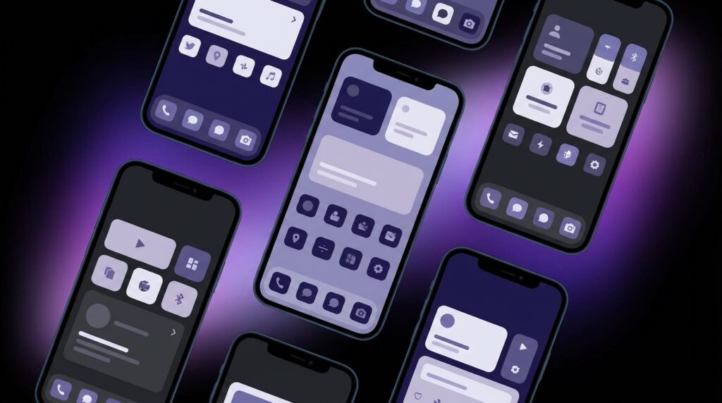
The Best Minimalist Android Launchers For 2025
Now to the part your current self cares about: which launchers are worth installing today if you want your phone to feel like a tool instead of a toy. I will focus on ones that are active, updated, and tuned for a cleaner experience.
Niagara Launcher: The Minimalist With Just Enough Flair
Niagara looks like someone took an old alphabetical contacts list from a candybar phone and taught it about gestures. When you first set it up, your home screen becomes a vertical list of your key apps, aligned near the left or right edge. Along the edge, you have an alphabet scroll bar. Glide your thumb over it and you fly through your app library.
The magic is in how much Niagara hides. There is no traditional app drawer. Your “home” and “drawer” merge into one list. Notifications for your key apps expand inline when you tap on them, so you can read a new message without opening the full app. It cuts small bits of friction in a way that feels neat without being flashy.
Minimal credentials:
– One main list instead of multiple pages.
– No cluttered widget panel; only compact “cards” attached to apps.
– Smart but optional features such as news headlines that you can turn off.
If you loved scrolling through long SMS threads on a tiny old screen, one line at a time, Niagara’s focused list view will feel strangely familiar, just sharper and much more responsive.
Smart Launcher 6: The Auto-Organized Toolkit
Smart Launcher has been around long enough to count as a digital senior. Over the years it evolved into a more polished, somewhat minimalist option that does automatic categorization. It is not as barebones as some text-only launchers, but you can strip it down.
The launcher places your favorites in a circular or grid arrangement on the main page, with a categorized app drawer that splits apps into “Communication,” “Internet,” “Games,” and so on. You can remove most visual decorations, shrink icon labels, and rely on gestures to keep everything tight.
Why it still works in 2025:
– Lightweight home screen with one main panel.
– Well-structured categorical drawer: fewer icons per screen, less hunting.
– A built-in “ultra immersive” mode that hides navigation and status bars.
You can turn Smart Launcher into a functional, minimal control panel that feels a bit like those old Sony Ericsson icons, but smoother. Think of it as a modern take on the old idea that every tool has its proper place.
KISS Launcher: Search, Text, Done
KISS looks almost austere. It gives you a search bar, a short history list of recent apps and contacts, and not much else. The name stands for “Keep It Simple, Stupid,” and it sticks to that principle.
You start typing, it gives you matches: apps, contacts, settings, even web shortcuts depending on your config. The whole experience feels like running commands instead of browsing icons. If you ever loved DOS prompts or compact Linux launchers, this feels natural.
You can:
– Hide every app from the visual layer and reach them only via search.
– Favor contacts or frequent actions, not just apps.
– Export and tweak configuration in a fairly lightweight way.
KISS is one of those launchers that makes your powerful Android feel like a fast, text-first PDA. Minimal in pixels, strong in intent.
Olauncher: Barebones With A Mind For Focus
Olauncher goes straight for minimal overload. No icons, just text labels. A black or white background. Up to eight apps on the home screen, no more. Everything else lives behind a vertical app list or search.
Olauncher also ships with some focus tools:
– You can hide app names and force yourself to swipe and search.
– There is an option to disable app icons in quick settings and recents, reducing visual triggers.
– Shortcuts are bound to gestures, not widgets.
This is the kind of launcher for someone who unlocks their phone to do one thing and then out. It feels like an updated version of an e-ink PDA from the mid-2000s, just with a ridiculous amount of extra horsepower.
Ratio (Where Minimalism Meets “Panels”)
Ratio splits your home into panels: one for apps, one for widgets, one for content. In basic mode, it can be stripped down to a very calm layout: black background, white text, straight lines.
The app panel groups apps into clear categories, which you can rename or hide. The widget panel can show tasks, notes, and weather without the usual Android chrome. Ratio’s look recalls early Windows Mobile or BlackBerry screens, where each line is packed with function but not a lot of color.
It is minimal in style, yet dense in what it can show. That combination gives you a focused dashboard, and if you dial back the widgets, you basically end up with a monochrome control center that feels far away from modern Android’s default bubbly colors.
Minimalist Launcher Features That Matter In 2025
So what should you look for if your goal is to turn your phone into a tool?
Hidden App Capability
The launcher should let you hide apps you do not want to open mindlessly. Social media, certain games, even app stores. Hiding them from the main surface is not security; it is friction. You can still find them by purposely searching, but you will not open them by habit.
Strong “Default App” Access
You want fast access to your core tools:
– Camera
– Notes
– Calendar
– Email or messaging
– Tasks
A good minimalist launcher lets you map these to simple gestures. Long press on empty space for notes, double-tap for camera, swipe up for search. When this feels natural, your phone starts to behave like that old feature phone that always open the same menu with the same key, just faster.
Low Resource Load
Some launchers eat battery with live animations and background processes. Minimal ones usually stay light. That matters on mid-range hardware and helps the phone feel snappier over time. Launchers like KISS and Olauncher are especially gentle, closer in spirit to those old feature phone UIs that ran on a fraction of today’s RAM.
Retro Specs: Sony Ericsson K750i (2005)
Screen: 176 x 220 pixels, 262K colors
Input: Joystick, 12-key pad, two softkeys
UI: Icon grid with text labels, shortcut bar for camera and media
Battery life: Measured in days, not hours, even with heavy SMS use
Comparing Then vs Now: UIs With Intent
To show how much the launcher itself shapes the feel of a device, compare an old classic with a modern flagship running a minimalist setup.
| Aspect | Sony Ericsson K750i | Android Flagship + Minimal Launcher (2025) |
|---|---|---|
| Boot To Ready | Cold boot, then instantly in standby with simple status bar | Boot animation, lock screen, then minimal home with text items |
| Unlock Gesture | Press unlock key combination on keypad | Fingerprint, face unlock, or swipe, then straight to blank-ish screen |
| Main Activity Flow | Open “Menu”, pick “Messages”, type SMS | Swipe, search ‘Signal’, open, send message |
| Distraction Spots | Java games folder, maybe WAP browser icon | Hidden behind search or app drawer, not sitting on home screen |
| Customization Style | Themes adjusted icons and wallpapers | Gestures, icon size, grid, hidden apps, focus modes |
| Intent Friction | Each action is a few defined button presses | Each action can be a single gesture or typed search query |
The nostalgic part enjoys how strict the old phones felt. You could not over-customize. The modern minimalist launcher gives you that same sense of clear pathways, but with your own routes.
Building Your Minimalist Home Screen In 2025
You do not have to throw everything away on day one. Think of this like tuning a favorite PC from the early 2000s. You are not wiping the hard drive; you are changing the shell.
Step 1: Pick Your Launcher
Install two or three contenders from the Play Store: for example, Niagara, Olauncher, and KISS. Set one as default, but keep the others to compare. Play with each for a full day. The one that interrupts your habits the right way is the keeper.
Step 2: Limit Home Screen Icons Aggressively
On day one, limit visible icons to:
– Phone or main call app
– One messaging app
– Calendar
– Notes
– Camera
Everything else is available via search or drawer. You want your home screen to feel like the standby screen on an old Nokia: no fluff, just gateways to actual tasks.
Step 3: Hide The Junk
Use the launcher’s hide feature to remove:
– Social media icons
– Shopping apps
– Streaming apps
– System tools you seldom open
You are not uninstalling them. You are just taking them off the frontline. If you really need them, you search by name.
Step 4: Tune Gestures To Match Old Habits
Think about what you reached for instinctively on past phones:
– Maybe you double-tapped an old Motorola’s side key for the camera.
– Maybe you long-pressed the central d-pad for contacts.
Map similar actions:
– Double-tap home to open the camera.
– Long-press home to open your favorite messenger.
– Swipe down to open search, not notifications.
Your fingers learn these quickly, and that muscle memory cuts through a lot of mental overhead.
Step 5: Keep Widgets Sparse
Use at most one or two:
– A simple clock + date widget.
– A compact tasks widget or calendar agenda.
Anything else risks turning the home screen into a status wall. You want a command screen, not a news dashboard.
How Minimal Launchers Change Phone Behavior
There is a quiet shift that happens once you live with a minimal launcher for a week.
Fewer Mindless Unlocks
You unlock the phone, you see almost nothing pulling on you. A clock. Maybe two names. Your brain goes: “What did I come here for again?” That small pause is gold. With a default launcher, your eyes catch a badge or a colorful icon and your intent drifts.
More Search, Less Browsing
Typing “cal” to open Calendar is faster than scanning 40 icons. The extra bonus: you cannot “accidentally” open YouTube while aiming at something else. The search funnel forces conscious choice.
Cleaner Visual Memory
Your mental map of the phone simplifies. A few gestures, a search box, a short list of shortcuts. That feels closer to those older phones where each function had a clear path. On a 2005 phone, there were not many places to get lost. A minimal launcher resurrects that quality on top of modern complexity.
User Review from 2005
“I know that if I press the right button two times I get my messages. I do not need to think. My brother’s smartphone has many screens and pictures. He is always searching.”
Minimal launchers are about turning your 2025 phone into that secure feeling: you know where things are, and nothing tries to ambush you.
Privacy, Ads, And The Launcher Question
The launcher sits between you and your apps. That position matters. Some modern launchers show ad banners in the app drawer or home screen. Others collect usage data incompatible with a clean experience.
For a minimalist setup, you want:
– No ads on the home screen or drawer.
– Clear privacy policy.
– Offline functionality for core features like search and app organization.
Launchers like KISS, Olauncher, and Niagara lean toward this kind of clean design. That quiet, no-ads vibe echoes older phone UIs that did not know what push ads were.
Minimalism For Power Users
Minimal does not mean basic. If you spend all day on your phone for work, a tuned launcher can make a clear difference.
Dynamic Dock vs Static Dock
Some launchers allow a dynamic dock that changes based on time, location, or habit. In a minimalist context, you can restrict this to a few work apps appearing during office hours, then fading away after. Old feature phones had “profiles” (Silent, Meeting, Outdoor). This is the 2025 spin: visual profiles for focus.
Integration With Automation Apps
Tools like Tasker or MacroDroid play nicely with minimalist launchers via shortcuts and widgets. You can bind a single, clean button to a complex workflow: log your location, open a timesheet app, start a focus timer. It feels like launching a “profile” on an old PDA, but with richer context.
Multiple Minimal Screens For Different Roles
You can keep:
– Screen 1: Work, with only mail, calendar, tasks, notes.
– Screen 2: Personal, with photos, reading apps, journaling.
– Screen 3: System, with settings, password manager, backups.
Each screen stays sparse. You swipe with intent, not by accident. That is the opposite of the modern stock approach where everything mixes into one messy grid.
Will Minimal Launchers Survive The Next Android Wave
Android keeps absorbing features that used to belong to third-party launchers: gesture nav, theming, Google Discover panes. At the same time, the core OS still lets you replace the launcher. Maybe one day that door will narrow, but today it is open, and developers are still building lean launchers that care more about your focus than your “engagement.”
From a hardware perspective, minimal launchers fit where phones are heading. Displays are bright and dense, chips are fast, RAM is plentiful. The limiting resource is not performance; it is your attention. That was never a factor on a 3310. You ran out of battery before you ran out of focus.
Minimal launchers quietly flip the script. They say: let the phone be powerful, but make the shell boring in a good way. Neutral. Predictable. Sometimes it feels like owning a modern sports car and choosing to drive it with an uncluttered analog dashboard instead of a blinking HUD.
Retro Specs: Symbian S60 2nd Edition
Devices: Nokia 6600, 6680, N70
Home: Operator name, signal, shortcuts row
Menu: Icon grid, folders for apps and tools
Patterns: Clear, fixed routes to core functions, limited custom shortcuts
Those patterns are what minimalist Android launchers in 2025 are recreating, almost by accident. Limited visible choices, clear entry points, predictable behavior.
The modern twist is that you get to pick the pattern that matches your habits: list-first like Niagara, search-first like KISS, text-only like Olauncher, or panel-based like Ratio. Each is a different answer to the same question you probably asked yourself while pressing that tiny joystick on your old phone: “How quickly can I just do the thing and then put this back in my pocket?”
