
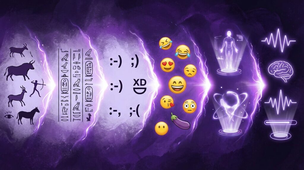
“The tiny Nokia screen lit up, and there it was: 🙂 built from three stubborn characters that somehow said more than the whole text.”
You remember that feeling, right? That moment when a plain SMS suddenly felt less robotic and more like your friend was actually in the room with you, smirking behind that clunky T9 keypad. Fast forward to today, you’re not typing 🙂 anymore. You’re pressing a glossy little yellow face that laughs, cries, rolls its eyes, or melts into a puddle. And half your conversations on WhatsApp, iMessage, or Discord run on those icons alone.
We went from typing “brb” and “lol” on a 12-key keypad to sending 🔥, 💀, and 🧠 in response to almost everything. So how did we get from sideways smileys on pixelated screens to full emoji keyboards that feel like a second language?
Let me rewind the tape a bit.
Back when phones were chunky, heavy enough that they pulled your pocket down, and the screens looked like a Game Boy with commitment issues, the idea of “visual language” in messaging felt wild. Those early LCD displays were barely up to the task of rendering numbers cleanly, let alone tiny faces. But people still tried. They hacked feelings into ASCII. They took colons, dashes, and brackets and stitched them together into moods.
And yet, when SMS plans finally went from “20 texts per month” to “go ahead, spam your friends,” the craving was the same as now: how do you show sarcasm, affection, or “I’m just teasing” without hearing tone of voice? That is the gap emojis stepped into.
The awkward start: from 🙂 to full emoji keyboards
Before emojis became their own universe, we had emoticons. Text-only. DIY. No color. No UI. Just you, your creativity, and way too much time on MSN Messenger.
On those early candy bar phones, your thumbs knew every key by feel. You could tell where the 7 key was without looking, and your muscle memory kicked in like magic. You typed:
– 🙂 for a normal smile
– 😉 when you were trying to be clever
– 🙁 when plans got canceled
The phone itself did not care. No autocorrect, no suggestions, no pop-up face. It was just raw characters on a greenish or grayish screen with backlight bleed around the edges.
Then Japanese mobile phones did something different.
How Japan quietly birthed modern emojis
In the late 1990s, Japanese carriers like NTT DoCoMo, SoftBank, and au were already dealing with a culture that loved visual communication. Stickers, manga, kaomoji like ^_^ and (T_T), and all sorts of text art were everywhere. Phone designers paid attention.
So they slipped in tiny 12×12 pixel icons into their messaging systems. Suns, umbrellas, hearts, faces. At first, it looked like a cute extra feature. Not some grand redesign of human communication. Just “Hey, why not let people insert a tiny face here.”
Those early emoji sets were grayscale or low color count but they had personality. The line art was simple, but the feeling came through. Suddenly, one tiny character slot carried mood, context, and a bit of flavor that text alone struggled to convey.
“Retro Specs: DoCoMo’s early emoji set had about 176 icons, living in a grid that felt like someone hid a secret menu inside your phone.”
These were not yet global. A Japanese phone could send them to another Japanese phone on the same network. But your Nokia 3310 in Europe, or your Motorola RAZR in the US, would just spit out blank squares or garbage characters if they even tried.
Still, the seed was planted: what if images and text lived in the same sentence?
The phones that taught us to feel through pixels
Before emojis broke out worldwide, our devices shaped how we expressed ourselves. The feel of the hardware changed the way we typed, and by extension, how we signaled emotions.
Think of the Nokia 3310. About 133 grams, curved plastic body, thick enough to feel rock solid in your hand. The screen sat in the top half with a light gray-green background and chunky, almost blocky text. No emojis. Just symbols, numbers, letters, and the occasional icon for battery or signal.
Then you had devices like the Sony Ericsson K750i. Sharper color screen, a bit more glossy, more icons in the UI. Still, no standardized emojis. But it started to feel like your phone could show more than it could before.
By the time Apple dropped the first iPhone, the whole experience shifted. Full-color capacitive touchscreen. Smooth glass up front, aluminum on the back. Fonts looked like print instead of 1990s game menus. That screen suddenly made tiny colored faces not just possible, but kind of irresistible.
At first, Apple hid the emoji keyboard for Japanese users only. A little regional Easter egg. People in other countries hacked their way to it through third-party apps, because of course they did. Once users saw that tiny sheet of expressive icons, going back to plain text felt like walking back into grayscale.
“User Review from 2009: ‘I installed this emoji app just to get the keyboard. Now I don’t even want to send normal texts…it feels flat without the faces.'”
This quiet demand from users nudged emojis from a niche feature into a global default.
From hacky add-ons to official Unicode residents
There was one huge problem in the early cross-country emoji era. A smiley on a Japanese phone was not the same as a smiley on an American phone. Different code points. Different image files. Some networks treated them like stickers, some like custom characters.
So if you sent a face, there was no guarantee the other side would see a face. Sometimes they would see mess. Sometimes nothing at all.
This is where Unicode entered the chat.
Unicode is the standard that decides which symbols get code points. Every letter, every number, every script, gets a slot. Once emojis entered that system, they became real characters in the same sense that “A” or “9” or “?” already were.
Now you could say: this code point is “grinning face,” this one is “pile of poo,” this one is “red heart.”
After that, any operating system or device vendor could design its own artwork for the same character. Apple could draw one style. Google could draw another. Samsung, Twitter, Microsoft, all put their own spin on the same code list.
That is why you sometimes send a 😏 thinking it looks sly and it arrives on your friend’s phone looking more angry than teasing. Same character, different art style.
Then vs now: phones, screens, and emoji language
The hardware jump from old-school phones to current flagships is not just about speed. It changed how expressive we can be with tiny digital faces.
| Feature | Nokia 3310 (2000) | iPhone 17-class phone (mid 2020s) |
|---|---|---|
| Screen size | 1.5 inch monochrome | 6+ inch OLED, edge to edge |
| Resolution | 84 x 48 pixels | Approx 2796 x 1290 pixels (or higher) |
| Emoji support | None, only ASCII emoticons | Full color emoji set, thousands of glyphs |
| Input method | T9 keypad, 12 keys | Multi-touch keyboard, emoji panel, voice input |
| Messaging | SMS only, 160 characters | Rich chat apps, gifs, stickers, emojis, audio, video |
| Storage | Limited, for SMS and a few ringtones | Hundreds of GB, full emoji fonts, sticker packs |
| Vibe when texting | Short, clipped, functional | Visual, expressive, full of icons and reactions |
On the Nokia-era screens, even if you tried to pack in tiny pictures, you would not get much nuance. Two dots and a curved line was about your upper limit.
On modern OLED panels, each emoji can have subtle blush on cheeks, light reflections in eyes, gradients in hair, and animated variations. You can see a difference between 😂 and 🤣, or between 😐 and 😑, just by how the mouth or eyes shift by a few pixels.
That visual resolution pulled emojis from “cute shortcut” into “micro expression language.”
Why we started sending faces instead of full sentences
Emojis solve a real problem in digital conversation: lack of tone.
When we talk face to face, you read body language, facial expression, timing, and pauses. When you text, your brain gets plain symbols on a flat panel and has to guess.
So people began using emojis as a kind of volume slider or tone marker.
– “Sure.” vs “Sure 😂”
– “We need to talk.” vs “We need to talk 😅”
– “Fine” vs “Fine 🙂”
Same word, totally different emotional weight.
And because typing is still slower than talking, emojis became shortcuts. Instead of saying “That is hilarious,” you send 💀 now as shorthand for “I am laughing so hard I’m dead.” Instead of saying “This is perfect,” you drop 🔥 or 🤌.
“User Review from 2013: ‘Sometimes I just send the crying laughing face three times. My friends know exactly what I mean. No text needed.'”
That is the key: emojis help compress emotion into a tiny visual unit. Not high art. Just quick, legible feelings.
How platforms molded emoji culture
Every platform shaped how users adopted emojis.
– iOS made them mainstream by baking the keyboard into the OS. You tapped a globe, a whole sheet of icons popped up.
– Android manufacturers sometimes added extra emoji styles before stock Android caught up, leading to weird mismatches between devices.
– WhatsApp, Telegram, and other apps included their own emoji rendering, smoothing out differences between brands for in-app messages.
Then social media poured gas on the fire.
– Twitter made emojis crucial for saving characters in a 140-character world.
– Instagram bios and captions turned into emoji-heavy taglines: 📍 City | 💻 Job | 🎧 Music.
– TikTok comment sections run on “💀,” “😭,” and random food emojis as inside jokes.
The more time we spent on these platforms, the more comfortable we got replying with nothing but visuals.
When emojis started to mean different things than their names
One of the most interesting twists in emoji history is that the assigned meaning and the actual social meaning drifted apart.
Take 😂 “face with tears of joy.” Officially, it is about laughter. For a long time it dominated as “this is so funny.” Then younger users started switching to 💀 for high-level laughter. Meanwhile, 😂 picked up a slightly older or cringe vibe in some circles.
Or the peach emoji 🍑. Unicode says peach. Your social brain says something else. Same for the eggplant 🍆.
This re-labeling happens in every language. Words shift. Emojis are no different.
Because emojis sit at the edge of language and image, they carry layers:
1. Literal: what the icon actually shows.
2. Intended: what the designer meant when they drew it.
3. Cultural: what your group or platform decided it is code for.
When these drift too far apart, confusion hits. Especially in cross-generational chats. Someone’s parent might send 🙂 thinking it is a friendly smile. Their kid might read it as passive aggressive.
“Retro Specs: Early emoji proposals rarely predicted modern slang uses. The eggplant was pitched as a vegetable. That went…somewhere else entirely.”
These reinterpretations show that emojis are not frozen. They live, shift, and bend to context.
Why some emojis feel “louder” than others
You can think of certain emojis like punctuation:
– 😂 at the end of a sentence acts like exclamation marks around “This is a joke.”
– 🙃 signals playful sarcasm or light annoyance.
– 😭 can be “genuinely crying” or “so funny I’m pretend-crying.”
Then you have tonal dampeners:
– 🙂 softens a blunt sentence, but can also edge into “I’m fake smiling through this.”
– 🤔 turns a statement into a thought instead of a final verdict.
You mix and match them almost like seasoning in a dish. A bit of 😂 here, a dash of 😅 there. Too many, and it becomes noisy. Too few, and messages read harsher than you mean.
The fascinating part is your brain now reads emoji patterns almost as fast as word patterns. When you see “ok 😭😭😭” your mind does not read each crying face one by one. It registers a kind of emotional burst.
Emoji packs, diversity, and the pressure to represent everyone
As emojis spread, one huge question showed up: Who gets represented?
For a long period, emojis were yellow by default and limited in occupations, family types, and appearances. This default drew criticism. People wanted a closer match to their identity, their relationships, and their environment.
So newer Unicode versions started including:
– Multiple skin tone variations.
– Different gender options for professionals and roles.
– Family combinations beyond the old “man + woman + child” model.
– Religious symbols, cultural clothing, and more varied hair types.
On the technical side, this required clever use of “zero width joiners” and codepoint sequences. That is how you can take a base person emoji and combine it with a skin tone modifier, or join multiple characters into a single composite like a family unit.
From a hardware view, it meant phones had to ship more complex fonts, more glyphs, and smarter rendering to treat a series of invisible characters as one icon. Your device takes what looks like several characters and paints a single emoji on the screen.
The social impact is still debated. Some users feel more seen when they can choose a closer match. Others treat emojis as largely symbolic and stick with the default yellow. But the pressure pushed vendors to keep expanding sets and to think more carefully about who these tiny characters represent.
The rise of stickers, gifs, and why emojis still matter
Once phones and apps could handle bigger images and animations, stickers and gifs charged into the chat.
– Stickers offer more complex art, full characters, and even text overlays.
– Gifs capture short clips from movies, memes, or reactions.
So why do emojis still hold such a strong place?
Size and speed.
Emojis:
– Load instantly on weak connections.
– Do not need downloads or packs in most cases.
– Fit inline with text naturally.
– Work across platforms better than custom sticker sets.
They are like the “system font” of emotional expression. Always there, consistent enough, and understood by almost everyone using a modern device.
Stickers and gifs are more like decorative fonts or illustrations. Fun, expressive, but not as deeply wired into every layer of the messaging stack.
In practice, users mix all three. You might open with text and emojis, escalate to a gif when something is really hilarious, then send a sticker that inside-jokes with your group chat. The emoji remains the quickest, lightest-weight tool in that toolbox.
How predictive keyboards learned your emoji habits
Once emojis became mainstream, keyboard designers saw a new chance: prediction.
Your phone now watches patterns like:
– Words you type before an emoji.
– Emojis you tap after certain contacts.
– Clusters you use together.
Type “happy birthday” and 🎉 or 🎂 shows up as a suggestion. Mention “pizza” and 🍕 slides into the bar. Hit “crying” and 😭 pops up waiting for a tap.
This changes behavior. You no longer dig through categories each time. The keyboard nudges you toward certain icons more often. Over months and years, this kind of soft nudge can influence which emojis feel “normal” for you.
The device becomes a quiet co-author of your emotional language.
On the technical side, phones ship large emoji fonts and predictive models that map language tokens to emoji candidates. Every year, when new emojis roll out, hardware vendors and app makers have to wire these new entries into keyboards, fonts, and prediction algorithms.
So when you see a brand new emoji appear on your keyboard, there is an invisible pipeline behind it: proposal, Unicode approval, glyph design, font update, OS update, app update, and finally, keyboard and prediction tuning.
Measuring mood through tiny faces: emojis as data
Marketers and analysts started noticing that emojis had patterns. Enough volume, and those patterns reveal mood swings in online conversations.
For example:
– Major sports events spark spikes in 🏆, ⚽, 🏀, or regional flags.
– Tech launches trigger 📱, 🚀, or 🤯 spikes.
– Bad news stories show more 😢, 😡, or 💔 in comments.
Platforms look at which emojis correlate with higher engagement, which ones cluster around positive comments, and which ones show frustration or confusion.
While this can veer into creepy territory, from a pure tech history angle it shows another shift: emojis moved from playful add-ons to measurable signals in large data sets.
Search engines, social networks, and analytics tools now have to treat emojis as first-class citizens in text. Indexing them, filtering them, and sometimes flagging them as part of sentiment detection.
Your “😂” reacts not just with your friend but with ranking systems and moderation tools under the hood.
Misfires, misreads, and the human side of emoji talk
For all the clarity they bring, emojis also introduce their own type of confusion.
Common problems:
1. Cross-platform design differences
You send a friendly 😁 from your Android phone. On someone’s older iPhone, the teeth look more clenched and intense. The message reads more aggressive than you meant.
2. Cultural gaps
A certain emoji might be harmless in one region and loaded in another. Hand gestures, animals, or food items sometimes carry local meanings that the sender has never heard of.
3. Generational drift
Older users might love 👍 as a polite confirmation. Younger ones sometimes read it as blunt or passive aggressive. Same with 💯, 💀, or 😭.
4. Overuse
If you finish every line with “😂😂😂,” the signal weakens. People stop knowing when you are actually amused and when you are just filling silence.
These hiccups remind us that emojis are not a perfect solution. They are another layer of language, with all the usual problems language carries.
Still, you see people adapt organically. In a group chat, norms form: which emojis mean what, which combos are playful, which ones cross into rudeness. Over months, that chat develops its own micro-dialect made of text, emojis, and recurring images.
Animated emojis, reactions, and the shrinking message
Hardware power and network speed opened the door for animated, live, and reactive emojis.
– Apple introduced Animoji and later Memoji, where your face tracking drives an animated emoji mask in real time.
– Some apps let you “react” to a message with a single emoji instead of sending a reply. A tap on “👍,” “❤️,” “😂,” or “😮” pins that emotion to the message.
Reactions are especially interesting. They shorten the loop:
– You do not write “I agree with this.”
– You do not even write “LOL.”
– You just react with an icon.
In busy chats, message lists become strings of text bubbles with tiny emoji counters attached. Upvotes through faces. Voting through micro-emotions.
From an archive point of view, these reactions show how conversations compress. Less text. More tiny, stacked icons hinting at consensus, support, or disagreement.
Emojis and smart homes: feelings beyond the phone
Once emojis became so recognizable, they jumped off the phone screen into other devices.
– Smart displays sometimes use emoji-like icons on weather screens or notifications.
– Wearables like smartwatches let you reply with quick emojis when typing is awkward.
– Connected devices, from TV apps to car systems, may show simple emojis or emoji-style icons for status and reactions.
A smartwatch is not fun for long texts. The screen is small, the input is clumsy. But tapping “❤️” or “👍” in response to a message feels just right on a tiny display.
In that sense, emojis act as a bridge between the old constraints of T9 texting and the modern world of voice, AI, and always-connected devices. They let you stay expressive without full typing, in contexts where typing is still a pain.
How AI is starting to predict and generate emoji-filled language
As language models and chatbots get better, they start mimicking how humans write in chats, including emoji use. You see:
– Smart replies in messaging apps that include suggested emojis.
– AI writing assistants that recommend “maybe add an emoji here to sound warmer.”
– Autocomplete features that finish phrases with emojis embedded at the end.
The tricky part is balance. Too many emojis from an automated assistant feels fake. Too few, and the tone reads stiff. So model training now quietly includes patterns from casual chat, including when and how people drop emojis.
From a digital archivist angle, this raises a curious question: where is the line between your real habits and the phone’s suggested habits? Over years, does the predictive system push you toward certain emoji styles that match its training data more than your original preferences?
We might look back later and see certain eras of emoji use shaped not just by culture, but by keyboard algorithms and AI templates nudging everyone in the same direction.
Then vs now: what “wordless communication” really feels like
If you compare early 2000s texting to current chat behavior, the change in wordless expression stands out.
| Aspect | Then (T9 & SMS days) | Now (smartphone & chat apps) |
|---|---|---|
| Non-verbal cues | ASCII emoticons like :-), ;), 🙁 | Full emojis, gifs, stickers, reactions |
| Message length | Short, compressed, heavy abbreviations | Mixed: short replies with dense emoji, or longer messages with visual punctuation |
| Creativity tools | T9 tricks, creative punctuation, caps | Emoji combos, reaction chains, multimedia |
| Hardware influence | 12-key plastic keypad, tiny monochrome screen | Touchscreen keyboard, high-res color, haptics |
| Emotional clarity | Relies on context and words mainly | Words plus emoji tone markers, but more chances for cross-interpretation |
| Standardization | No official emoticon list, purely informal | Unicode standard for emojis, yearly updates |
In both eras, people tried to patch the same gap: making flat text feel human. The tools changed shape, the screens grew up, but the goal stayed familiar.
“User Review from 2005: ‘I type 🙂 because I don’t want her to think I’m mad when I’m not. It’s just text, she can’t hear my voice.'”
That early review could just as easily be written today about 🙂 vs 😐 vs 😭. The concerns are the same. The vocabulary got brighter, colored, and standardized, but the underlying itch did not go away.
We still worry: How will this message sound in their head?
So we hover over the emoji panel, scroll a bit, and tap the one tiny face that feels right for this exact moment. Then we hit send and hope that little icon carries our tone across that glowing glass into someone else’s hand.
